
Taupe Bedding Ensembles: A Complete Layering Guide
You've found the right wall color, chosen a new headboard, and saved several calm, hotel-inspired bedrooms. Yet when you place a taupe duvet on the bed, something feels slightly wrong. In daylight, it looks gray. At night, it turns beige. The problem usually isn't taupe itself. It's the undertone, texture, lighting, or fit surrounding it.
A successful taupe bedding ensemble works as a coordinated system. You'll need to choose the right shade, combine textures that create depth, size every layer for your mattress, and care for each fabric according to its needs. Taupe has moved beyond a niche accent into the broader warm-neutral movement. A 2026 bedding trend review found that earthy warm neutrals, including taupe, continued replacing cool gray from spring through late summer, while texture layering became more important in neutral beds.
Why Taupe Bedding Ensembles Work Right Now
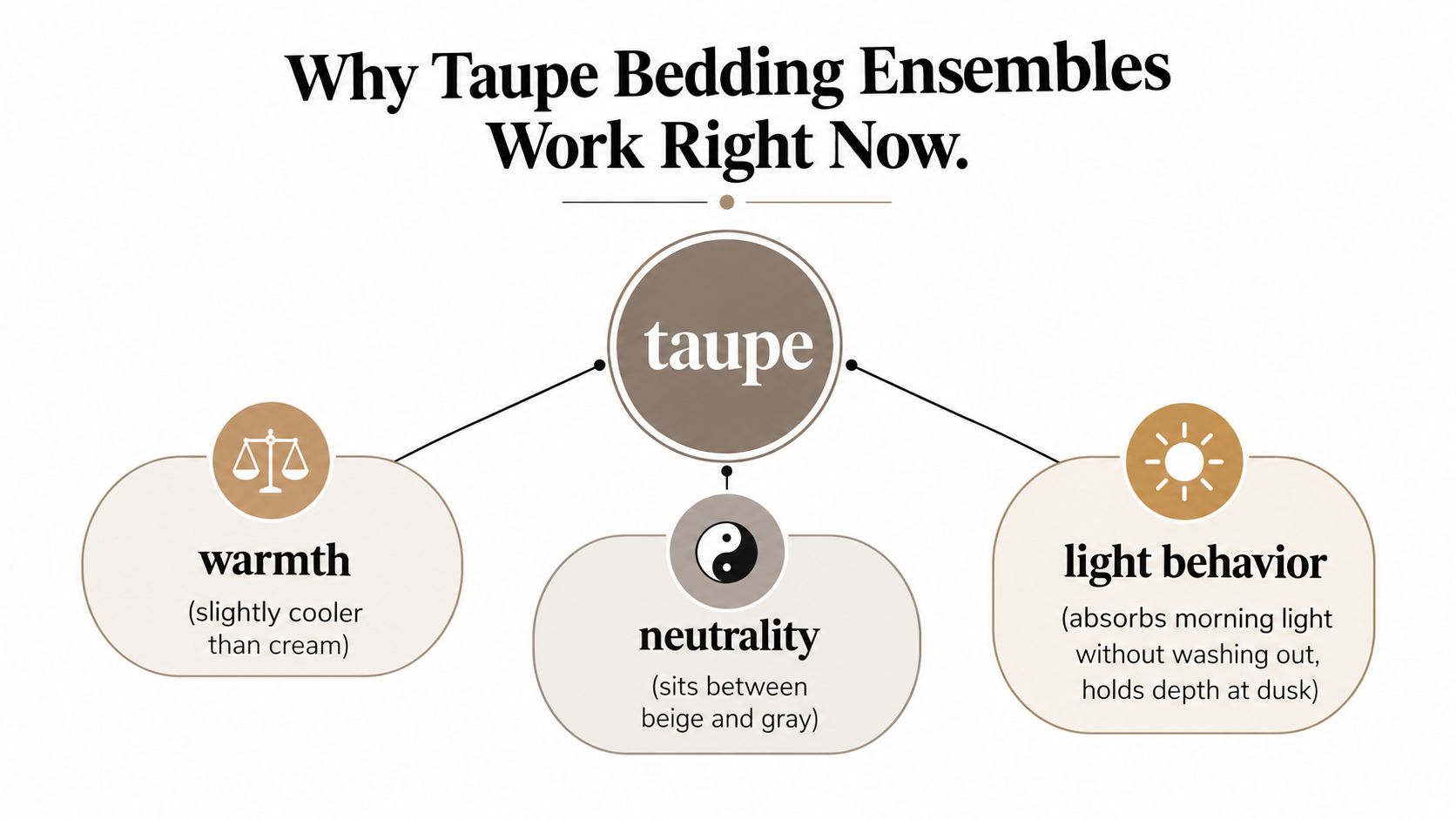
Taupe sits between beige and gray, but it isn't a compromise between the two. Depending on its undertone, it can feel softly brown, gray, or slightly mushroom-like. That flexibility lets it connect cream walls with gray upholstery, warm wood with black metal, or natural linen with polished hardware.
The shade also behaves differently throughout the day. A well-chosen taupe can absorb bright morning light without looking washed out, then hold enough depth under an evening lamp to keep the bed from disappearing. A taupe that leans too gray may feel chilly, while one that leans too yellow can blend into oak furniture and lose definition.
A neutral with staying power
Taupe has played this bridging role in home textiles for years. An archived 2007 to 2008 home-textiles design clipping described taupe as strong in replacing natural or ecru within palettes and listed gray, silver, taupe, and ivory among newer bedding shades. That history supports what many shoppers now notice: taupe isn't a passing color label, but a durable transition neutral.
Current demand also fits the wider bedding category. A 2026 industry report estimated the global bedding market at USD 153.12 billion in 2026, up from USD 144.43 billion in 2025. The report placed North America at 32.60% of the market and projected online business-to-consumer sales to be the fastest-growing channel at a 7.92% CAGR through 2031. These figures don't tell you which duvet to buy, but they show why neutral, easy-to-coordinate bedding has such broad commercial relevance.
Stylist's rule: Treat taupe as an undertone decision first, a decorating decision second.
The rest of the bed follows four practical jobs: select a shade that agrees with the room, add texture so the neutral doesn't look flat, confirm that the layers fit your mattress, and wash them in a way that protects the color.
Picking the Right Taupe for Your Room
Start with the room, not the product photograph. Online images often make beige, oatmeal, greige, and taupe appear interchangeable, but their undertones become obvious beside your wall, floor, and furniture.
Test the shade twice
Hold a fabric swatch against the wall in mid-morning daylight. Then repeat the test beneath the bedroom's main lamp after dark. A taupe that looks balanced during the day can turn pink, green, yellow, or gray at night, depending on the bulb and the surrounding finishes.
Use the wall and wood tone as your anchors. Pink-leaning taupes can suit cool, north-facing rooms with white walls, while green-leaning taupes can settle more comfortably beside warm wood and stronger southern light. If your room mixes several temperature families, choose a softer, less committed taupe and let texture provide the variation.
A practical range includes greige, stone, driftwood, mushroom, and putty. These names aren't standardized, so treat them as starting points rather than guarantees. Ask for a physical swatch whenever possible, or test a spare pillowcase before committing to a complete duvet and sheet combination.
| Taupe Family | Undertone | Best Wall Color | Light Direction |
|---|---|---|---|
| Greige | Balanced gray-brown | Soft white or pale gray | North or mixed light |
| Stone | Quiet gray with earthy depth | Warm white or muted gray | Bright south light |
| Driftwood | Brown-gray with natural warmth | Cream, oatmeal, or light wood tones | East or mixed light |
| Mushroom | Soft brown with a muted cast | Dusty white or pale beige | Diffused or north light |
| Putty | Warmer beige-brown | Cream, tan, or warm white | South or west light |
For more guidance on coordinating wall colors, wood, and bedroom finishes, the Woodstock Furniture & Mattress Outlet palette tips offer a useful comparison point.
Leave visual distance from the wall
Don't match the bedding to the wall exactly. Choose a taupe that sits one visible tone step away from the wall in either direction. A slightly lighter bed against a mid-tone wall creates air, while a deeper bed against a pale wall gives the room a clear focal point.
Finish the test with a navy or charcoal cushion. If the accent looks clean beside the taupe, the undertone is probably controlled. If the cushion makes the bedding appear green, pink, or muddy, return to the swatch stage before ordering the full ensemble.
Choosing Textures That Make Taupe Sing
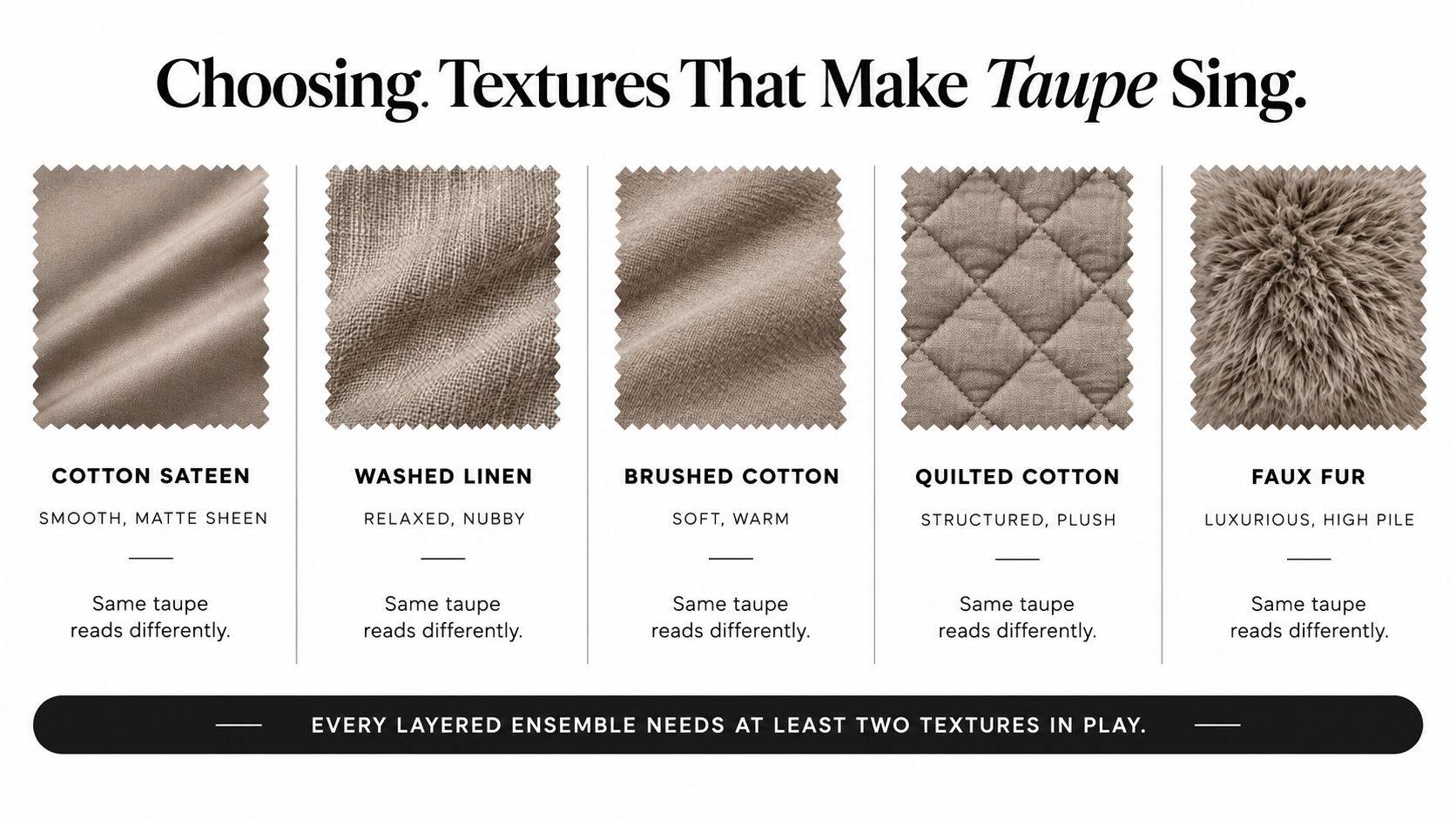
Color alone can't carry a layered neutral bed. The same taupe may look polished in cotton sateen, relaxed in washed linen, cozy in brushed cotton, structured in quilted cotton, and plush in faux fur. Texture changes how light moves across the surface, so it changes the apparent depth of the color too.
Cotton sateen reflects light with a gentle sheen. That makes taupe appear smoother, slightly lighter, and more formal, which suits a hotel-style room with furniture that has clean, simple lines. Washed linen absorbs light and introduces a nubby surface, making the shade feel softer and more casual. Brushed cotton adds warmth through its raised finish, while quilted cotton or matelassé creates small areas of shadow without introducing another color.
Build contrast through surface
A bed can use one taupe shade and still look dimensional if the surfaces behave differently. Try a smooth sateen sheet, a quilted cotton coverlet, and a chunky throw. The eye sees variation even when the palette stays restrained.
A wool bouclé or faux-fur throw pulls visible warmth into the arrangement and makes taupe feel more cocooning. Velvet has the opposite effect. Its directional pile catches light in a way that can make taupe feel cooler, deeper, and more luxurious.
A reliable formula: Pair one smooth fabric, one visibly textured fabric, and one chunky or plush fabric.
That formula also makes seasonal changes easier. You can replace a faux-fur throw with washed linen without rebuilding the entire bed, or swap a sateen coverlet for quilted cotton when you want less shine. For a focused styling example, see this guide to a taupe throw blanket.
Choose at least two distinct textures in every ensemble. A single flat microfiber surface may look acceptable in a product image, but it often loses depth across a large bed in changing light.
Layering Sheets, Quilts, and Throws
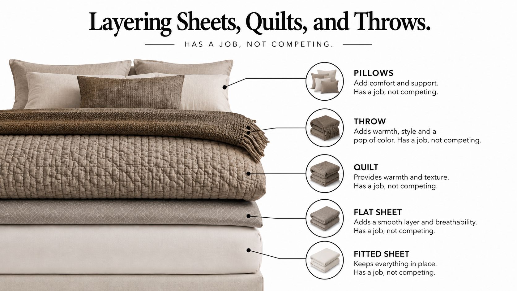
Each layer should have a job. If every piece has the same color depth, weight, and surface, the bed becomes a block of taupe. If every piece competes for attention, the arrangement feels busy rather than restful.
Begin at the mattress and work upward.
- Fitted sheet: Use the lightest taupe, cream, or soft white neutral. This layer sits against the skin, so a pale tone keeps the bed feeling clean and breathable visually. It also creates a quiet canvas beneath the layers above.
- Flat sheet: Choose a slightly deeper taupe or a close neighboring neutral. When folded over, it frames the top edge and gives the sleeper a visible transition between the fitted sheet and the quilt.
- Quilt or coverlet: Make this the middle-value anchor. Quilted cotton and matelassé work particularly well because their structure adds dimension without requiring a pattern. The coverlet should drape evenly on three sides without touching the floor.
- Duvet: Fold it at the foot of the bed in the deepest taupe. Concentrating the darkest value low on the bed grounds the composition and keeps the upper sleeping area visually lighter.
- Throw and pillows: Add the strongest texture here. A lumbar pillow, folded knit, faux-fur throw, or velvet cushion can introduce contrast without overwhelming the neutral base.
Keep weight consistent through the year
For warm weather, keep the fitted and flat sheets light and use a breathable quilt as the principal cover. In colder months, retain the same color order but add a denser duvet or plush throw at the foot. This preserves the room's visual logic while changing the insulation.
A smaller bedroom may benefit from a lower, simpler profile. Before choosing an oversized coverlet or tall headboard, review these compact bedroom low bed ideas for ways to keep the bed from dominating the room.
The guide to layering bedding can help you refine pillow placement and fold-back proportions.
Five-layer check: lightest fitted sheet, slightly deeper flat sheet, middle-value quilt, darkest foot-folded duvet, textured throw and pillows.
Pairing Accent Colors and Finishes
Taupe changes character according to its neighbors. The same coverlet can feel coastal beside ivory, botanical beside sage, luxurious beside brass, or sharply modern beside black. Choose the accent palette after you've tested the taupe against the wall and furniture, not before.
Cream and ivory soften the entire arrangement. They work especially well when the taupe has a gray cast, because the warm whites prevent the bed from feeling cold. Eucalyptus green and muted sage create a quiet botanical mood, particularly with matte ceramics, woven baskets, and rattan.
Brass and antique gold bring out taupe's warmer side. Use them in a lamp base, picture frame, or small tray rather than repeating the finish across every surface. Matte black, oil-rubbed bronze, and charcoal do the opposite. They sharpen taupe's gray side and support a modern, minimalist bedroom.
Warm oak and other earthy woods help taupe feel grounded, but the exact pairing matters. A yellow-orange wood can make a cool taupe appear disconnected, while a quieter oak or natural wood finish may create a more deliberate organic palette.
| Accent Palette | Best Hardware Finish | Resulting Mood |
|---|---|---|
| Cream and ivory | Brushed nickel or pale wood | Soft, coastal, Scandinavian |
| Eucalyptus and muted sage | Matte black or aged bronze | Botanical, calm, spa-like |
| Brass and antique gold | Warm brass | Layered, polished, hotel-inspired |
| Charcoal and black | Matte black or oil-rubbed bronze | Modern, graphic, restrained |
| Oak and natural wood | Aged bronze or matte ceramic | Organic, earthy, relaxed |
Avoid using bright primary blue or saturated pink across large surfaces. Small accents can work, but at scale they fight taupe's quiet balance and make the bed look disconnected from the room.
Before buying pillows or throws, place a taupe swatch beside both the wall color and the wood tone. If the shade works against those two fixed elements, the accent choices become much easier.
Sizing and Fit for Deep Mattresses
A beautiful taupe bedding ensemble won't look finished if the fitted sheet pulls off the corners or the coverlet exposes the mattress sides. Measure the mattress with its protector in place, because the protector contributes to the finished height.
Pillow-top and hybrid mattresses commonly measure 14 to 18 inches, according to the sizing guidance supplied for this article. Adjustable bases may sit higher still, so use your actual bed rather than a product category as the measurement reference.
Measure before ordering
Match fitted-sheet pocket depth to the measured mattress height, with extra room for the protector and your preferred tuck. A snug fit needs less excess fabric, while a hospital-corner tuck needs more. Product labels such as “deep pocket” and “extra deep” aren't consistent across brands, so compare the stated pocket depth with your measurement.
A flat sheet needs enough width to fold smoothly without pulling back during sleep. If you prefer a generous fold-over, choose an oversized sheet rather than forcing a standard one across a tall mattress.
For quilts and coverlets, calculate the drop from the top of the mattress to the point where you want the edge to end. The finished bed should show an even fall on both sides and at the foot. Keep the hem above the floor so it doesn't collect dust or drag when you move around the bed.
Account for movement
Adjustable bases need flexible fitted sheets. Stretch-knit constructions can follow the head incline more easily, while rigid percale may bind or pull at the corners when the base moves.
A split-king or dual-adjustable setup usually works better with two Twin XL fitted sheets than with one oversized king fitted sheet. Each side can move independently, and the center seam won't force one sheet to resist the other.
Use this checklist before checkout:
- Pocket depth: Compare the listed depth with the mattress and protector height.
- Corner security: Look for strong elastic and, when useful, corner straps.
- Coverlet drop: Confirm that the quilt clears the floor while covering the mattress sides.
- Pillow alignment: Check that pillowcases match the insert size and don't distort the top edge.
- Base movement: Choose stretch and separation appropriate for an adjustable or split bed.
For a more exact measurement method, use this guide to measure mattress depth before selecting pocket size.
Care and Maintenance for Long-Lasting Color
Taupe stays attractive when you treat each fabric according to its weight and construction. Start by sorting pieces rather than washing the entire ensemble together. Keep heavy cotton quilts away from lighter linen throws, and separate darker taupe pieces from cream or soft-white layers until you know how the dyes behave.
Use cool to lukewarm water and a pH-neutral, dye-free detergent as your everyday default. Reserve hotter washing for suitable white cotton items in their own load, and always follow the care label before changing the temperature.
Reduce friction and residue
An overloaded drum rubs fabric against itself. That friction can encourage pilling on sateen and damage the raised structure of matelassé or quilted weaves. Give bulky quilts room to move, and use a second rinse when detergent residue remains on the fabric.
Residue can dull the surface and make taupe look uneven, especially on textured materials that hold product between the fibers. Measure detergent carefully rather than adding extra because the load looks large.
Drying depends on the textile. Tumble-dry cotton on low with wool dryer balls when you want to restore loft and reduce clumping. Line-dry linen flat when preserving its relaxed drape matters more than removing every wrinkle.
Laundry rule: A clean, correctly sized load protects both the color and the fabric structure.
Deep-pocket fitted sheets need special attention around the encased elastic. Remove them promptly when the cycle ends instead of leaving them compressed in a warm, damp drum. That small habit helps prevent the elastic from settling into a stretched shape.
Store every piece completely dry
Fold bedding only after it's fully dry. Place acid-free tissue between folds when storing delicate or textured pieces, then use breathable cotton bags to allow air circulation. Avoid plastic storage for long-term keeping, since trapped moisture can contribute to yellowing and stale odors.
For active households, hosts, and high-use beds, label the sets by size and layer type. Keep fitted sheets together with their matching pillowcases, and store throws separately so heavy fibers don't press against lighter fabrics.
SouthShore Fine Linens offers oversized bedding, extra-deep pocket sheet sets, quilts, and taupe options such as the Perfect Paisley Reversible Comforter Set and the Mystic Garden collection in Taupe Grey, giving shoppers a way to build a coordinated ensemble around fit and texture rather than color alone.
Choose your taupe swatches in both daylight and lamp light, measure your mattress with its protector, and assign every layer a clear job before you order. Visit SouthShore Fine Linens to explore taupe bedding, oversized quilts, and extra-deep pocket essentials that can help you build a polished ensemble for real bedrooms and everyday use.


