
Dusty Rose Bedding: A Practical Guide to Style and Care
You're standing in the bedding aisle with a dusty pink quilt over one arm, trying to decide whether it looks refined or too sweet for your bedroom. The answer rarely comes from the color name alone. Dusty rose bedding succeeds when the shade, fabric, lighting, and surrounding layers work together.
Dusty rose can make a room feel warm without becoming loud, but it can also look unexpectedly beige, mauve, brown, or gray once it meets your walls and evening lighting. The most reliable approach is to treat the purchase as both a design decision and a practical one. You'll want to test the undertone, choose a construction suited to how you sleep, and confirm that the color can withstand the care routine your household follows.
Why Dusty Rose Works in the Bedroom
You may be refreshing a bedroom that feels too plain, but you don't want the obvious contrast of bright pink. Dusty rose offers a quieter alternative. Its softened appearance bridges the warmth of traditional neutrals with the personality of color, so a quilt or duvet can become the room's defining feature without making every other element compete.
Unlike vivid pink, dusty rose has a lower apparent saturation and gentler contrast. That lets it function as a foundational textile shade rather than only a small accent. The gray or brown influence also helps it sit comfortably beside ivory, beige, taupe, charcoal, and warm white.
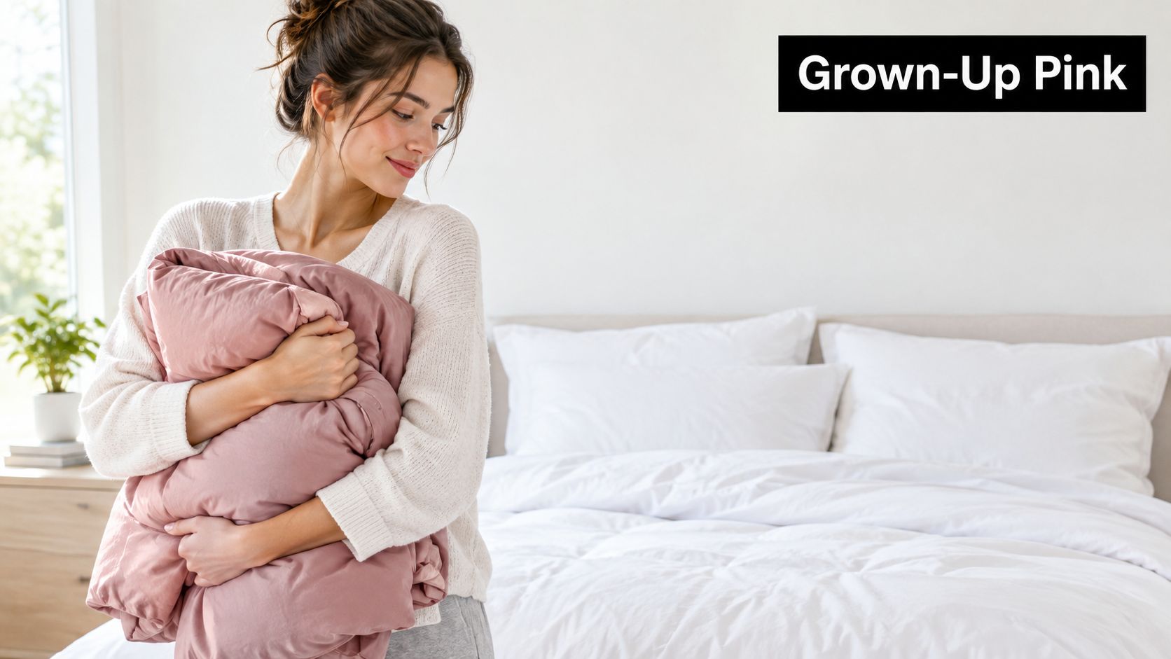
A color that changes with the room
Dusty rose can feel earthy beside oatmeal linen, elegant beside charcoal, or fresh beside sage. It also photographs well because its muted surface tends to look layered rather than glaring, especially when paired with tactile fabrics and restrained neutrals. For a broader look at how bedroom colors influence atmosphere, explore bedroom color psychology.
That flexibility makes the shade useful across seasons. In warmer months, pair it with crisp percale, pale wood, and a lightweight quilt. In colder months, add a nubby throw, deeper taupe, or warm brass. The color stays familiar while the textures change the room's energy.
Practical rule: Choose dusty rose for the feeling you want, then judge the actual sample under the lighting you live with.
The rest of the decision comes down to four layers: identify the precise rose family, match the fabric to your comfort needs, build a controlled palette, and protect the color through sensible care. A bedroom can look polished and still handle pets, children, frequent washing, or a deep mattress.
Understanding the Dusty Rose Color Family
Dusty rose isn't one universally fixed color. It's a family of pinks muted by gray, brown, taupe, or related earthy influences. Contemporary references include representative shades such as #DCAE96, #D4A3A9, and #C9A9A6, while Pantone identifies 17-1718 TCX Dusty Rose as a standardized textile shade. These references are useful, but they don't guarantee that two fabrics labeled dusty rose will look identical. (Contemporary dusty rose references and Pantone information)
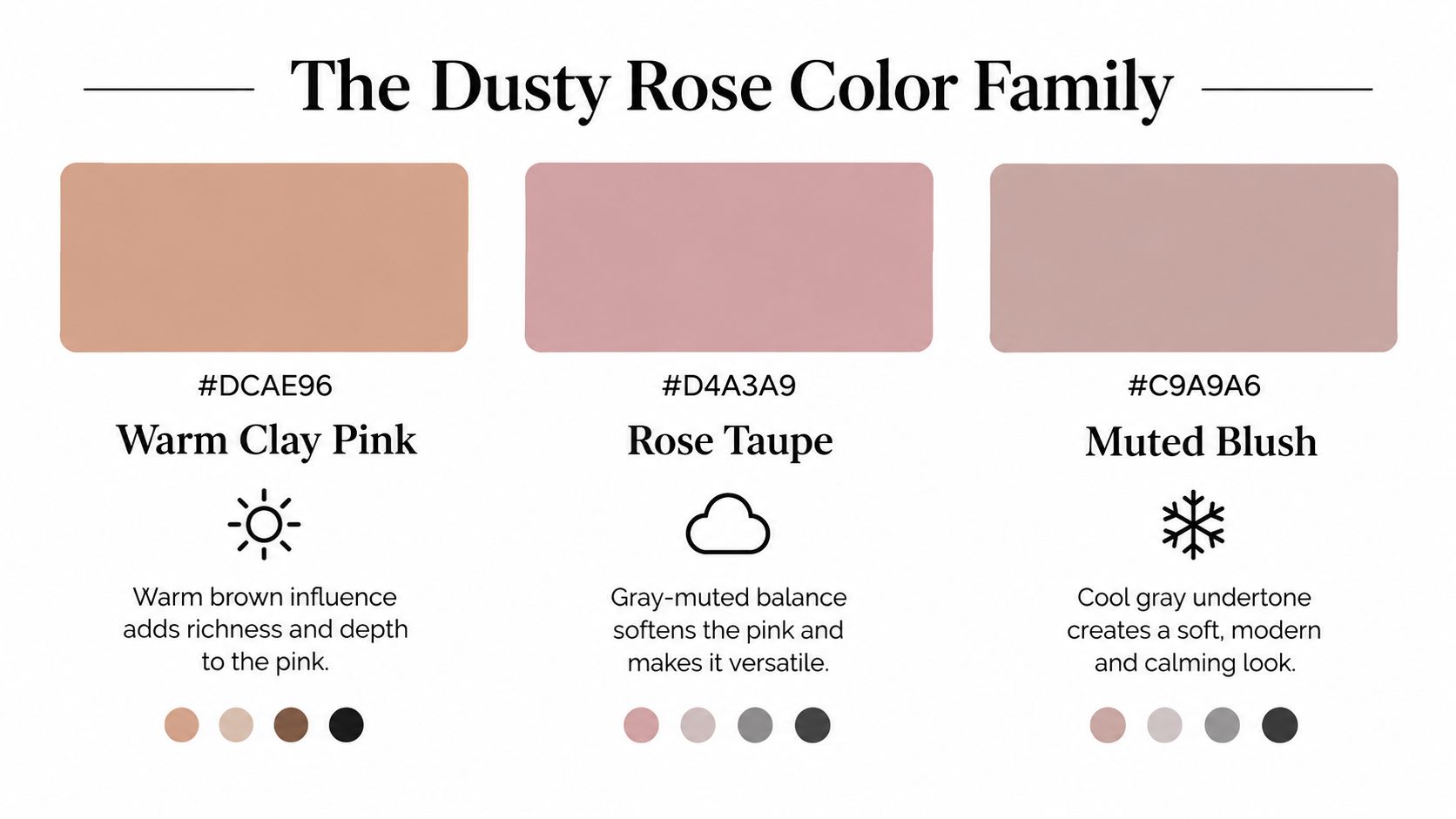
Read the undertone, not just the label
A brown-influenced rose may look like warm clay beside bright white. A gray-muted rose can appear more mauve or restrained next to ivory. A cooler version may feel elegant beside charcoal but slightly flat beside cool gray walls. Fiber, weave, dye lot, surface finish, lighting, and nearby colors all affect the result.
Before buying a complete set, order a swatch when possible. Place it beside bright white, ivory, oatmeal, charcoal, and sage. Then inspect it in north-facing daylight, warm evening lamplight, and the artificial LED lighting in the bedroom. If the swatch turns muddy beside your wall color, the undertone is working against the room. If it becomes too pink beside your existing sheets, choose a more gray or brown-influenced alternative.
The surrounding neutral acts like a visual reference point. Bright white can make the rose appear more saturated, while oatmeal or warm cream usually quiets it. Charcoal increases contrast and gives the bedding a more refined look. Sage brings out the earthy side without creating a sugary palette.
For more ideas on combining related shades, use these color combinations for bedding as a starting point, then test the exact fabrics in your own room. A measurable color reference helps with production and merchandising consistency, but texture and display settings can still change what your eyes perceive.
Best Fabrics and Textures for Dusty Rose Bedding
The same dusty rose dye can look noticeably different on smooth sateen, crisp percale, washed cotton, textured linen, or microfiber. Surface reflection changes the color's apparent depth. A sheen can make the warmth more visible, while a matte weave tends to soften the shade.
The best choice depends on how you sleep, how often you wash the bedding, and whether you want the color to look polished or relaxed. Cotton Incorporated's 2024 bedding survey found that 75% of consumers prioritized quality and 72% softness, while 32% bought bedding for a new color and 30% for a new style. (Cotton Incorporated bedding survey)
| Fabric | Color Rendering | Feel | Care Level | Best For |
|---|---|---|---|---|
| Cotton percale | Matte, clear, and softly crisp | Cool and structured | Moderate | Hot sleepers and a tailored bed |
| Cotton sateen | Slightly luminous and warmer-looking | Smooth and supple | Moderate | A polished, cozy appearance |
| Washed cotton | Softened and gently varied | Relaxed and broken-in | Easy to moderate | Casual rooms and everyday use |
| Linen | Tonal variation from natural texture | Airy and tactile | Moderate | Warm climates and organic interiors |
| Microfiber | Even and visually consistent | Smooth and lightweight | Often easy | Budget-conscious or low-maintenance rooms |
How construction changes the color
Sateen's surface catches light, which can make dusty rose appear richer and warmer. Percale has a flatter visual character, so it often makes the shade feel calmer and less decorative. Washed cotton introduces small variations that suit an informal bedroom, while linen's texture can make the color look more complex from different angles.
If you're considering percale for a structured sheet set or sewing project, browse cotton percale sewing tips for a useful explanation of its construction and handling. The important distinction is that fiber content alone doesn't determine performance. Yarn, weave, finishing treatments, trim, and the finished item all influence softness, color stability, shrinkage, and seam appearance.
Thread count also shouldn't be your sole filter. A higher count doesn't automatically mean better durability or a more stable shade. Look for a well-made construction, a clear care label, and test information tied to the finished product. You can also compare additional constructions in this guide to bedding fabric types.
For a hot sleeper, percale or linen may feel more comfortable. For someone who prefers a smooth hand and a slightly dressier bed, sateen may be the better match. Families and frequent launderers should prioritize documented wash performance over an especially soft first impression.
Color Palettes That Make Dusty Rose Shine
Dusty rose becomes easier to style when you assign every color a job. Use it as the anchor, then let the supporting shades control whether the room feels earthy, dramatic, airy, or romantic. A practical version of the 60-30-10 distribution principle gives the dominant color most of the visual space, a secondary color supports it, and a smaller accent adds definition.
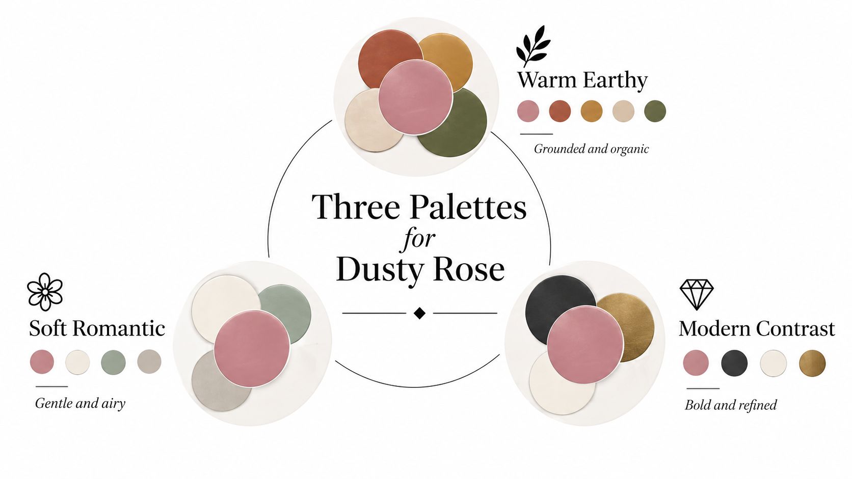
Warm earthy
Use dusty rose with terracotta, ochre, warm beige, and olive green. This combination suits clay-colored walls, natural wood, woven baskets, and a jute or wool rug. Choose aged brass for lamps and hardware, then add an accent pillow with a subtle geometric or botanical pattern.
The result feels grounded because the rose shares warmth with the surrounding materials. If your room already has honey oak or warm flooring, select a dusty rose with brown or terracotta influence rather than a cool mauve.
Cool moody
Pair dusty rose with charcoal, deep navy, ivory, and silver gray. Keep the walls soft rather than stark, and use charcoal in a lumbar pillow, bench, or folded blanket instead of spreading it across every surface. Brushed nickel supports the cooler direction, while a small amount of ivory prevents the room from feeling heavy.
This palette works well when you want dusty rose to look refined rather than delicate. The dark anchor gives the bed visual weight.
Bright coastal
Combine dusty rose with crisp but softened white, sage, weathered blue, and pale natural wood. A dusty rose quilt can sit over ivory sheets, with a sage throw and a blue-striped lumbar pillow. Choose woven shades, rattan, or painted furniture to maintain the relaxed character.
For broader guidance on coordinating wall, furniture, and accent colors, Lott's Furniture color inspiration offers a useful reference. Keep the palette close-toned if you want the room to feel current over time. Warm plaster-like pinks and muted earthy shades generally have more staying power than a highly saturated novelty color.
Layering Your Bed for a Curated Look
Start with one clear foundation. A dusty rose sheet set creates a quiet color field, while a dusty rose quilt or duvet makes a stronger statement. Don't make every layer the same shade. Small differences in value and undertone create depth, especially when the bedding uses similar colors.
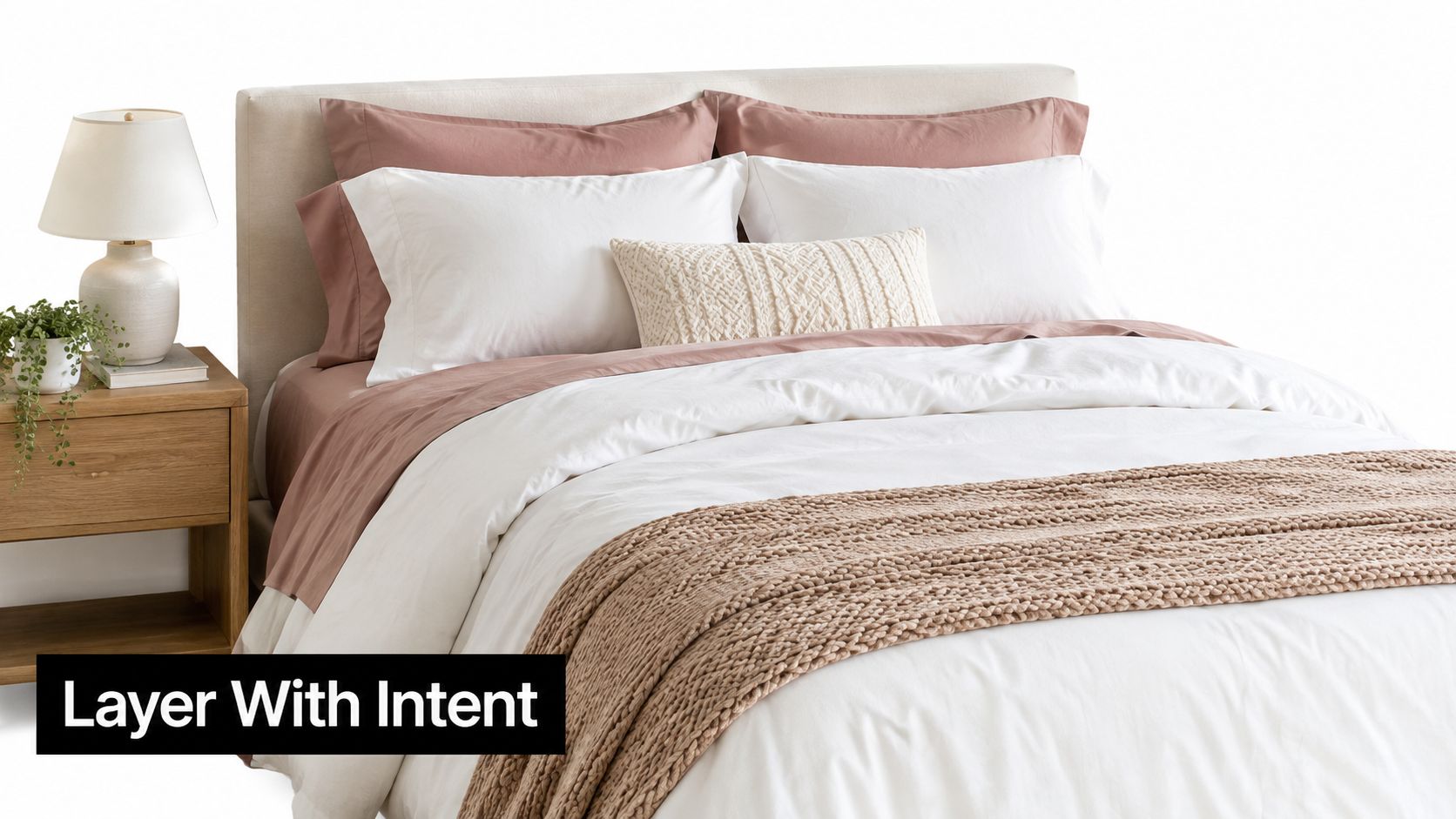
Build from the sleeping surface outward
Use this order:
- Foundation: Start with sheets in dusty rose, ivory, oatmeal, or warm white. Ivory and oatmeal create a softer transition than a brilliant white.
- Main layer: Add a quilt, duvet cover, or comforter. If the sheets are dusty rose, consider a neutral main layer. If the duvet carries the rose, keep the sheets quieter.
- Foot layer: Fold a quilt or throw across the lower third of the bed. Texture matters more here than exact color matching.
- Pillows: Arrange European shams at the back, sleeping pillows in front, then add one or two decorative pieces. A lumbar pillow gives the eye a horizontal resting point.
A smooth sateen sheet beside a textured quilt prevents the color from looking flat. Linen, boucle, chunky knit, and quilted cotton each catch light differently, so a near-monochrome bed can still feel dimensional.
If the duvet and sheets are different dusty rose shades, repeat one of them in a small cushion or trim detail. Contrasting piping, embroidery, or a narrow border can make the difference appear intentional rather than mismatched. Keep at least one layer neutral if the two roses have noticeably different undertones.
For a visual example of proportion, texture, and pillow placement, this short video can help:
Summer styling can use a lightweight quilt and a single textured cushion. Winter styling can add a heavier coverlet, wool or faux-fur throw, and deeper accent tone without changing the core dusty rose foundation.
Room Pairings for Different Design Styles
Dusty rose doesn't belong to one decorating language. The furniture, wall color, and hard finishes determine whether it reads as minimal, coastal, romantic, or Nordic.
Modern minimalist
Use dusty rose as the single color statement against warm white walls, clean-lined furniture, and restrained black accents. Choose a matte quilt or simple duvet with minimal stitching. A black reading lamp, slim picture frame, or dark bedside table keeps the palette from becoming overly sweet.
Avoid adding several decorative pink objects. The bedding should carry the color, while the rest of the room provides structure. Pale oak or walnut can soften the contrast without creating visual clutter.
Coastal or Hamptons
Pair dusty rose with navy stripes, ivory, weathered blue, and natural rattan. The shade can echo sandy neutrals while adding warmth to a palette that might otherwise feel cool. Use relaxed curtains, woven lighting, and a striped lumbar pillow to make the bed feel breezy rather than formal.
If the room has a blue-gray wall, choose a warmer rose with some brown influence. A cool mauve may look disconnected from the sandy and wood elements.
Romantic or French country
Layer dusty rose with soft cream, small-scale vintage florals, antique brass, and lightly distressed wood. Keep the pattern controlled. One floral pillow or embroidered sham is enough to suggest a collected look without turning the bed into a theme.
Natural linen curtains and a softly colored rug can connect the bedding to the rest of the room. A creamy wall usually works better than bright white, which may make the rose seem sharper.
Scandinavian
Use dusty rose to warm a gray-and-white room, then add pale wood, simple shapes, and a sheepskin or nubby wool texture. Choose a restrained rose with gray influence so it works with the cooler foundation. Keep window treatments simple and let daylight reveal the contrast.
The common mistake across all four styles is choosing accents that pull the color in the wrong direction. If the bedding looks too sweet, add charcoal, black, or weathered wood. If it looks too cold, introduce oatmeal, brass, terracotta, or warmer lighting.
Care and Maintenance for Lasting Color
Muted colors can reveal problems that a busy pattern hides. Dusty rose may show detergent residue, oil buildup, uneven fading, or color transfer when washing conditions aren't suitable. Good care starts with the label, not a universal laundry formula.
Wash in cold or warm water according to the manufacturer's instructions. Use a detergent without optical brighteners when the care guidance permits, since brightening agents can change how the rose appears. Separate dusty rose bedding from high-lint towels and wash new pieces separately until you know how the dye behaves.
What colorfastness testing tells you
A retailer or manufacturer's phrase such as “fade resistant” doesn't tell you enough. ISO methods separate different forms of exposure:
- Light exposure: ISO 105-B02 evaluates resistance to artificial light.
- Washing: ISO 105-C02 and ISO 105-C06 evaluate laundering conditions.
- Rubbing: ISO 105-X12 addresses crocking, or color transfer through friction.
Washing and rubbing scales typically run from 1 to 5, while lightfastness commonly runs from 1 to 8, with higher grades indicating better resistance. (ISO textile colorfastness methods) Ask for the named method, wash cycles, detergent conditions, and gray-scale result when you're evaluating premium bedding.
For a fresh stain, remove excess material without rubbing it deeper into the cloth. Blot with cool water, follow the care label, and test any treatment on an inconspicuous area. Body oils, cosmetics, food, and pet marks may need prompt attention because heat can set some stains.
Families, pet owners, and short-term rental hosts should prioritize finished-product testing, sturdy construction, and a care label that matches frequent laundering. Direct sun also deserves attention. Avoid prolonged exposure through an uncovered window, particularly for a muted shade whose intentionally softened character can be changed by uneven fading.
Building Your Dusty Rose Bedroom
Begin with the room, not the shopping cart. Place a dusty rose swatch beside your wall color, flooring, existing sheets, and the metals already in the room. Check whether the undertone stays comfortable in daylight and under your evening lamps.
Next, choose construction according to real use. Hot sleepers may prefer percale or linen, while someone seeking a smoother, more polished feel may favor sateen. If you wash frequently, look for documented colorfastness and inspect the finished construction, including seams, trim, and dimensional stability.
Finally, build the palette around one hero piece. A quilt, duvet cover, or sheet set gives you enough color to evaluate without forcing a complete room redesign. For readers interested in textile collaboration and product development resources, you can browse the gifted collaboration tool.
Dusty rose bedding should look good on the first day and remain livable after repeated use. Test one piece, observe it through different lighting, and expand only when the shade, texture, fit, and care routine all make sense.
SouthShore Fine Linens offers sheet sets, quilts, duvet covers, and other bedding essentials in designs suited to layered bedroom palettes, including options for oversized and deeper mattresses. Visit SouthShore Fine Linens to find a practical foundation for a dusty rose bedroom that feels comfortable, coordinated, and ready for everyday use.


