
Bohemian Bedroom Sets: How to Layer, Color and Source
You've found a patterned duvet you love, but beside your existing curtains and rug, it suddenly looks busy. Add a textured throw and decorative pillows, and the bed starts feeling crowded rather than relaxed. The fix usually isn't another accessory. It's giving each layer a clear job, checking the fit, and deciding which pieces stay on the bed when you sleep.
What a Bohemian Bedroom Set Actually Includes
Buying a printed matching set doesn't automatically create a bohemian bedroom. A coordinated duvet and shams can be useful, but the room needs contrast between smooth fabric, tactile surfaces, furniture, and objects that feel personal.
Bohemian bedroom sets work as a foundation plus layers, not a mandatory matching suite. The style's eclectic approach draws on an artistic tradition associated with creativity, nonconformity, handmade decoration, and layered textiles, rather than identical furniture, as described in this study of bohemian design history.
Build From the Sheets Outward
Start with the pieces that affect comfort and fit. Then add the visible cover, tactile contrast, restrained accents, and optional room accessories.
Core layers of a bohemian bedroom set
| Layer | Role in the room | Typical pieces | Buy it when |
|---|---|---|---|
| Foundation | Sets the base color and fit | Fitted and flat sheets in solid or tonal colors | Always first |
| Cover layer | Carries the main pattern | Duvet cover with matching shams, reversible if possible | After the base color is set |
| Texture layer | Adds woven or tactile contrast | Waffle or jacquard quilt, linen-look throw | Once the pattern is chosen |
| Accent layer | Adds restrained accent colors | Decorative pillows, lumbar cushion, small rug | Last, keeping accents visually subordinate |
| Room extras | Ties textiles to furniture | Bed skirt, woven basket, wall hanging | Optional, after the bed works |
The foundation should solve the least glamorous problems first: corners that slip, a flat sheet that barely tucks, or fabric you don't enjoy against your skin. A beautiful cover won't compensate for sheets that pull loose overnight.
The cover layer supplies the main visual statement. The texture layer should do something different, such as adding raised waffle detail beside a smooth printed duvet, rather than repeating another equally assertive print.
Use the hierarchy below to connect the bed with storage and decoration without treating everything as another shopping requirement.
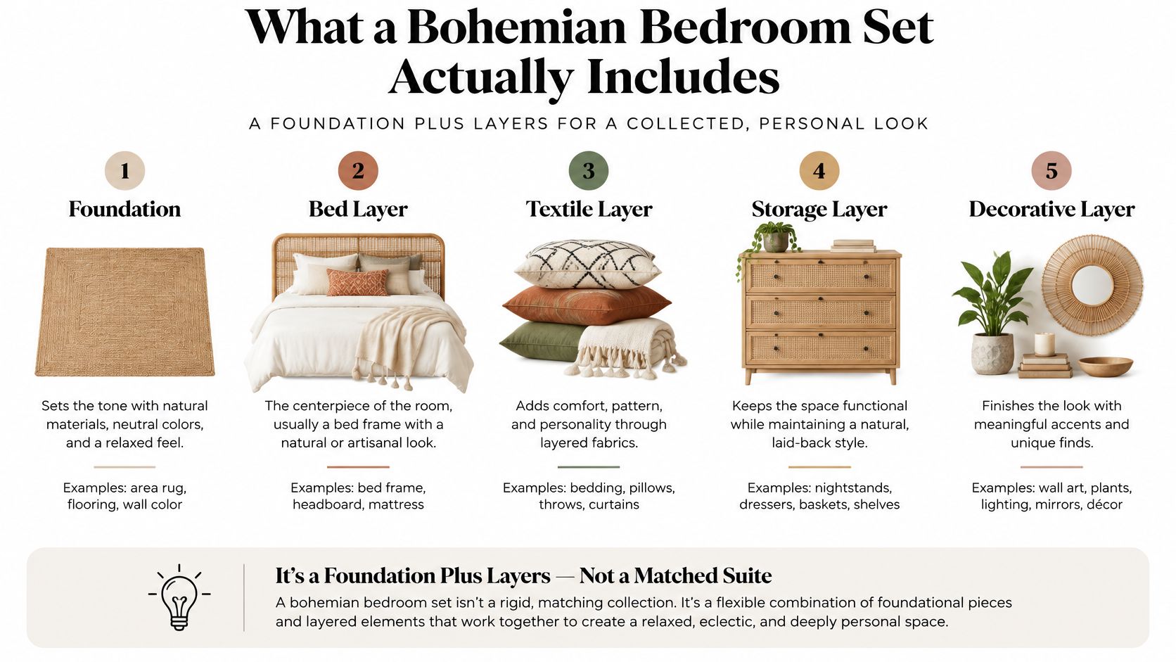
For a queen-bed arrangement, try sheets, a duvet with sleeping-pillow shams, a folded quilt, and a lumbar cushion before adding more pillows. Leave room to put decorative pieces away at night, especially if the bedroom has limited storage.
Practical rule: Choose the foundation first, add a main pattern and a contrasting texture, and stop while the bed still looks calm from the doorway.
Pick a Palette With the 60-30-10 Split
Use the 60-30-10 split as a color hierarchy: roughly 60% dominant base, 30% secondary color, and 10% accents, following the approach outlined by Homes & Gardens' room-color guidance. These are visual proportions, not a shopping list or a requirement to measure every surface.
Count the room, not just the bedding. A dark upholstered headboard or large wood wardrobe already occupies visual space, even if you aren't replacing it.
| Share | Room surfaces | Bedding application |
|---|---|---|
| Dominant base | Walls, large upholstery, broad neutral surfaces | Oatmeal or sand fitted and flat sheets supporting a quiet cover |
| Secondary hue | Drapes, headboard, substantial furnishings | Terracotta or ochre quilt |
| Accent | Artwork, ceramics, small accessories | Indigo or sage pillows and a lumbar cushion |
Sheets alone won't establish the dominant color when they're hidden beneath a duvet. Judge the palette with the bed fully made, not with all the fabrics spread separately across the floor.
Make the Palette Before Buying
- Photograph the room in daylight and under the lamps you use at night.
- List the largest existing surfaces, including flooring, walls, curtains, and upholstery. Keep their undertones in view.
- Choose a dominant hue and a supporting hue. Try warm sand with terracotta, or muted sage with indigo.
- Reserve the strongest contrast for a textile or artwork focal point. Don't make both compete for attention.
- Repeat colors across materials. Carry a bedding tone into glazed ceramics or artwork, and let wood supply a compatible warm note.
Pattern accumulation becomes clutter when every purchase introduces an unrelated palette. A floral duvet, striped curtain, and geometric cushion can coexist, but they need recognizable color connections.
The split is an adjustable starting ratio, not a guarantee. Before buying a duvet cover, place fabric swatches beside the headboard and curtains in morning light, evening light, and lamplight. If a neutral turns pink or green in your room, solve that mismatch before ordering the largest textile.
How to Layer a Bed Without Overheating
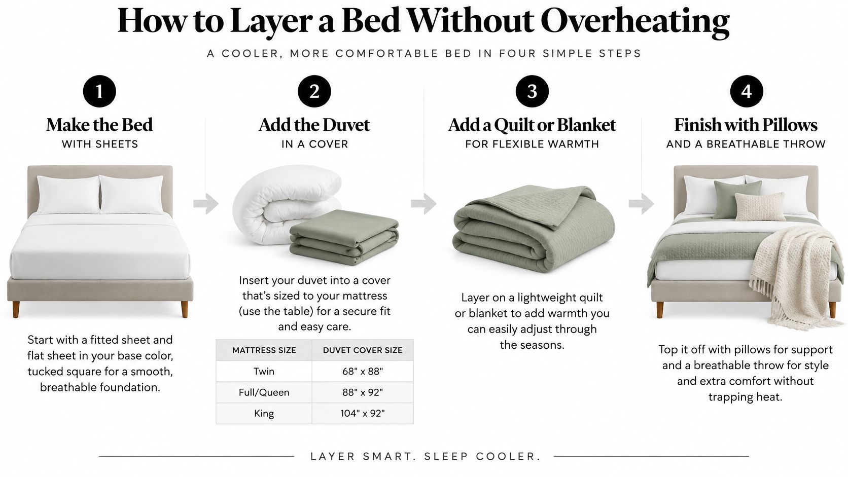
- Make the foundation. Fit the sheet corners securely and smooth the flat sheet. Tuck neatly without pulling so tightly that the foot becomes restrictive.
- Fit the duvet to its cover. Compare the insert's actual dimensions with the cover specification, distribute the filling into the corners, and place the closure at the foot.
- Fold the textured quilt at the foot. Keep it contained so you see its surface without creating another full-bed insulating layer.
- Place the throw deliberately. Use it at the foot or on a nearby bench, not automatically across the sleeping area.
- Arrange pillows by size. Put the largest against the headboard and smaller accents forward. Remove decorative pillows before sleeping.
- Test the sleeping combination. Spend a night under the layers you intend to use, then remove or change whichever makes the bed too warm.
Think of the decorative arrangement and the sleeping arrangement as separate setups. This graphic shows how to keep the build manageable.
Measure the Mattress, Not the Frame
Use a tape measure across the mattress width and length, then measure its full depth with the topper in place. Compare that depth with the fitted sheet's stated pocket capacity. A label such as deep pocket isn't a substitute for the actual measurement.
Duvet-cover dimensions aren't interchangeable across brands. Use the following check rather than assuming a bed-size name guarantees matching measurements.
Mattress and duvet cover sizes by bed size
| Bed size | Mattress (in) | Duvet cover (in) |
|---|---|---|
| Twin | Measure actual width × length | Match the insert's listed width × length |
| Full | Measure actual width × length | Match insert dimensions and check side coverage |
| Queen | Measure actual width × length | Match insert dimensions and check coverage over mattress depth |
| King | Measure actual width × length | Check insert dimensions and orientation |
| California King | Measure actual width × length separately from King | Confirm length and insert compatibility |
For a sizing scenario, subtract your mattress width from the proposed cover width, then divide the remainder equally between the sides. That gives an approximate side drop before accounting for loft. Use it to judge whether the bedding will conceal the mattress edges without dragging.
Separate Warmth From Texture
Choose a lightweight insert for a warm bedroom, and move the quilt off the sleeping area when it isn't needed. Cotton sateen generally feels warmer than crisp percale, but fabric weight, filling, and your room conditions also affect comfort.
For more detail on arranging removable layers, use our guide to layering bedding. On an adjustable base, raise the head and foot before deciding whether tucked fabric or an oversized cover interferes with movement.
Use this demonstration as a visual companion to the build order.
The finished bed should have covered edges and an even surface, not a mound of competing blankets. Let the overnight comfort test decide what stays.
Mix Patterns Without Making the Room Cluttered
More patterns don't make a room more convincingly bohemian. They often make it harder to appreciate the print you liked in the first place.
The restrained approach described in Livingetc's bohemian bedroom edit uses tonal bedding, woven accents, warm lighting, and natural materials without turning the whole room into a theme. That's a useful direction when you want character without daily rearranging.
Give Each Pattern a Different Job
Use a dominant textile, a secondary texture, and a limited accent palette. A large floral duvet can lead, a medium geometric cushion can support it, and solid sheets can provide the quiet background.
Scale matters more than collecting different motif names. Tiny florals beside tiny geometrics can merge into visual noise, while a broad floral beside a restrained stripe is easier to distinguish.
For help evaluating the whole room rather than isolated swatches, Slone Brothers Furniture's guide to balancing patterns in room design is a useful companion. Our bedroom pattern-mixing guide applies that decision to bedding combinations.
Edit for the Room You Have
- King bedroom: A broader surface can accommodate a substantial folded quilt, but don't fill every exposed area with cushions.
- Queen in a small room: Keep the cover expressive and the shams solid, particularly when curtains or wallpaper already have pattern.
- Studio: Use tonal bedding and a woven throw so the bed doesn't compete with the seating area.
- Guest room: Favor removable, washable covers and a straightforward arrangement guests can remake without instructions.
Keep the strongest textile pattern on the bed, then remove accessories that compete with the headboard.
In a rental, subtraction is especially useful. Before buying wall decoration, clear the nightstands and assess whether the bedding already provides enough detail.
Lighting and Fixture Scale for Layered Rooms
A bright ceiling fixture flattens the textures you layered and puts glare directly above the pillows. Plan light in three jobs instead: ambient for moving around the room, task for reading in bed, and accent for drawing out rattan, carved wood, or a woven throw.
In this room, the fixtures share space with natural textures without every lamp competing for attention.

Position Light Before Choosing Shades
- Map the bed, the reading position, and walking routes, including access to switches.
- Fit dimmable ambient light so general illumination never has to run at full brightness.
- Aim reading lamps at the page, angled away from the other sleeper's eyes.
- Add low accent light where it grazes a woven surface or artwork, keeping cables out of walking routes.
The following starting benchmarks are suggested in HGTV's bedroom design advice: bedside lamps around 24–27 inches, sconce tops 50–60 inches above the floor, and warm light at 3000 K or lower.
Lighting benchmarks for a layered bedroom
| Fixture | Benchmark | Placement |
|---|---|---|
| Central ceiling fixture | Diameter in inches equals room length plus width in feet | Centered and dimmable |
| Bedside lamp | About 24–27 inches tall | Beside each sleeper, shade at reading height |
| Wall sconce | Top about 50–60 inches above the floor | Reading zone or above the headboard |
| Bulb color | 3000 K or lower | Across sources for warm evening light |
Treat the ceiling formula as a scale check for visual weight, and leave mounting and wiring decisions to the fixture's instructions. A dense woven shade reads larger than an open fixture of the same diameter, so a rattan pendant can run slightly smaller than the formula suggests and still fill the visual field.
Verify lamp height against the actual bed. Sit against your pillows and check whether the shade clears your sightline while still throwing light on the page. Mattress elevation and a tall frame can lift the sleeper well above a lamp that looked correct on a showroom nightstand.
Heat is the last check. Keep canopy fabric, macramé hangings, and throw edges clear of bulbs, and follow the fixture manufacturer's clearance instructions.
Choose Certified Bedding That Lasts Through Washing
Earthy colors and natural-looking fabric don't establish textile safety. Fiber content, appearance, and independent testing answer different questions. Cotton identifies a fiber, while linen-look describes an appearance and may say nothing about the underlying material.
A product's OEKO-TEX certification concerns the requirements of its particular certification program. It doesn't automatically promise that the item won't shrink, pill, fade, or need careful laundering.
OEKO-TEX reported more than 57,000 certificates issued in 2024–2025, alongside over 18,000 MADE IN GREEN-labeled products offering verifiable supply-chain information, in its annual-report announcement. Its updated substance restrictions also underline why checking current certification matters.
Check the Product and Its Care Requirements
- Verify the exact item. Confirm that the certification applies to the bedding you're buying, not merely another product from the same brand.
- Read the composition. Check fiber content and weave rather than relying on a soft-focus photograph or descriptive collection name.
- Check laundering limits. Note wash temperature, bleach restrictions, drying method, and whether the cover can move freely in your washer.
- Check color release. Wash a new dark or saturated cover separately. If concerned, test an inconspicuous damp area with a white cloth before combining it with pale bedding.
- Inspect after washing. Look for pilling, seam distortion, and persistent odor. Odor alone isn't proof of harmful substances, but a persistent problem deserves follow-up.
Our Bamboo bedding carries OEKO-TEX Certification. Our explanation of OEKO-TEX-certified bedding provides additional context for evaluating labels.
Buying check: Certification helps assess tested requirements. The care label helps you decide whether the bedding fits your laundry routine.
Neither an earthy appearance nor certification alone proves every aspect of responsible production. Verify the certificate's scope and choose care requirements you can realistically maintain.
Build Your Set in Three Purchases
Start With the Foundation
Buy the sheet set that fits your measured mattress and feels right against your skin. Choose the base color with your existing flooring and furniture nearby, rather than trying to coordinate from memory.
Keep a note of the product dimensions and care instructions. That becomes your reference when selecting the visible layers.
Add the Cover, Then the Texture
Next, choose the cover that supplies the main pattern. Our Grand Symphony Duvet Cover Set in blue pairs cotton sateen with a watercolor floral print and matching shams, and the design is offered in Twin/Twin XL, Full/Queen, and King/California King sizes; the blue variants are currently sold out.
Finish with a textured quilt or throw selected for its intended job. If it's decorative, prioritize a manageable fold and easy storage. If you'll sleep beneath it, prioritize its weight and laundering requirements.
For renters, removable bedding offers a room refresh without paint or drilling. In a studio, choose a finish that also looks comfortable beside the sofa, since both areas share the same view.
Run the Checkout Check
- Match dimensions: Compare mattress, pocket depth, insert, and cover measurements.
- Confirm color: Examine available swatches in daylight beside existing finishes.
- Verify certification: Check the exact item and applicable label.
- Plan laundry: Make sure the largest layer suits your washer and drying setup.
Buying from the same collection can simplify coordination, but it doesn't guarantee identical care requirements. Read each label separately, and choose the foundation today rather than buying every decorative layer at once.
SouthShore Fine Linens offers sheets, duvet covers, oversized quilts, and throws for building a bohemian bed around fit and everyday comfort. Visit SouthShore Fine Linens to choose your foundation, then add a patterned cover and tactile finishing layer once your palette and measurements are settled.


