
Bed Cover Green: How to Choose the Right Shade
You've found a sage cover that looks perfect on your phone, then it arrives and reads grey on your bed, yellow under your lamp, and nothing like the photo. That isn't bad luck. It's undertone, light and fibre doing exactly what they always do. A bed cover green in name can be cool, warm, muted or saturated, and two covers with the same label can clash with the same wall. Judge the swatch in your room, not the name on the listing, and you'll avoid most return trips.
Choosing the Right Green for Your Bedroom
For most bedrooms, a muted sage, eucalyptus or olive reads calm. Choose forest or emerald when you want a traditional or moody room. Start there, then adjust for undertone and light.
Undertone matters more than the shade name. A grey-leaning sage sits comfortably with cool whites and pale oak because it carries very little yellow. A yellow-brown olive does the opposite. It warms up next to warm oak, cream and terracotta, and it can look muddy against a blue-white wall.
| Shade | Undertone | Bedroom Style It Suits | Avoid Pairing With |
|---|---|---|---|
| Sage | Grey-leaning | Scandinavian, minimalist, modern farmhouse | Cool grey walls with no warm texture |
| Eucalyptus | Blue-grey | Coastal, spa-inspired, calm modern | Bright white walls with chrome and no wood |
| Olive | Yellow-brown | Earthy, boho, rustic | Pink or peach walls that clash |
| Forest or hunter | Deep blue-green | Traditional, library, moody luxury | Small dim rooms with no lamps |
| Emerald | Saturated blue-green | Glam, art deco, statement bedrooms | Busy patterned walls |
| Mint or seafoam | Pale blue-green | Light, airy, cottage, nursery | Pale grey walls that wash it out |
| Lime or neon | Bright yellow-green | Playful, accent-only rooms | Full bedding sets in dark rooms |
Test the Light Before You Decide
Hold each swatch by the window at midday, then under your bedside lamp at night. North-facing light pushes greens cooler and sometimes bluer. Warm bulbs push them toward yellow, so a sage that looked fresh at noon can look tired by evening.
Saturated greens need room size in the equation too. Emerald looks rich in a small, dim room because the depth feels intentional. In a large bright room, that same saturation can feel heavy across a whole bed. Lime and neon work best as a single accent through a cushion or throw rather than a full cover.
Keep the sleep claim in perspective. The Sleep Foundation guide to bedroom colour notes research directly linking bedroom colour to sleep remains limited, while green is commonly associated with nature, comfort, peace, spaciousness and positive emotion. Muted shades suit a restorative setting, especially in matte or low-sheen fabric that limits glare. That's an environmental comfort choice, not a proven sleep treatment.
If you're still weighing wall colour against bedding, find soothing bedroom color ideas to see how paint tones shift the mood, and use our bedroom colour basics guide to check undertone against your existing palette.
Practical rule: Hold the swatch against your wall and floor together. Keep the shade that looks quiet, not the one that shouts for attention.
Fabric Choices That Change How Green Looks
The same dye changes on every fibre because sheen changes how light hits colour. A matte fabric absorbs light and softens green. A glossy fabric reflects it and makes the same green look richer and darker in the folds.
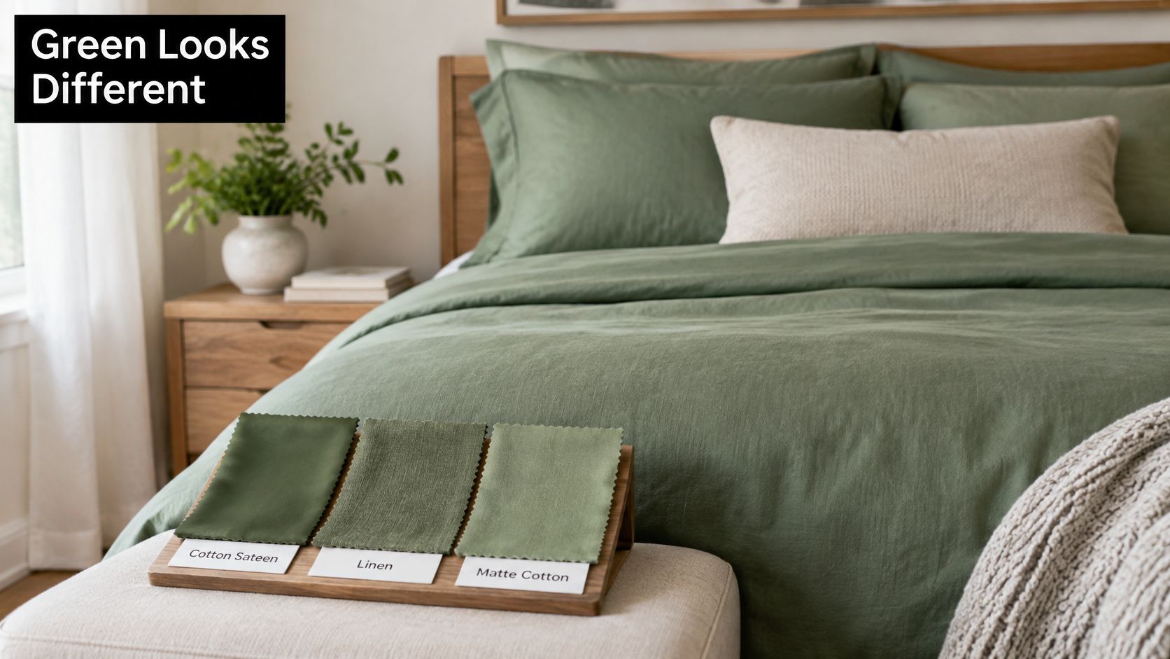
| Fabric | Sheen | How Green Looks | Best For | Trade-off |
|---|---|---|---|---|
| Cotton sateen | Soft gloss | Rich, smooth colour | Everyday bedrooms, classic styling | Shows creases more readily |
| Percale cotton | Matte | Crisp, clean sage | Warm climates, cool summer bedrooms | Less drape |
| Linen | Matte, slub texture | Relaxed, natural olive | Boho, coastal, farmhouse | Wrinkles until it softens |
| Velvet | Plush, light-catching | Deep forest or emerald | Glam, moody luxury | Heavy, needs dust control |
| Tencel lyocell | Subtle sheen | Fluid, saturated green | Soft drape, sleep-focused rooms | Higher cost |
| Microfibre polyester | Low sheen | Bright, even green | Budget, kids, high-use beds | Pills and sheds fibre in the wash |
Cotton sateen gives sage a polished, hotel feel, but you'll see creases where you sit on the bed. Percale keeps sage crisp and pale, which suits warm bedrooms where you don't want visual weight. Linen breaks olive up with slub texture, so the colour looks sun-worn rather than flat, though it wrinkles until repeated washing softens it. If you're photographing or styling a room, interior photography lighting techniques show why that texture reads so differently in side light versus overhead light.
Match Look to Service Life
Velvet deepens forest and emerald because the pile catches light at angles, yet it collects dust and feels heavy in summer. Tencel lyocell drapes in soft folds with a subtle sheen, so green looks fluid rather than stiff. Microfibre gives an even, bright green at low cost, but it pills sooner and sheds fibre in the wash.
Durability isn't a side issue. The European Environment Agency textiles overview reports each person in the European Union consumed an average of 16 kilograms of textiles in 2020, generating a carbon footprint of about 270 kilograms. It also reports only 4.4 kilograms per person were collected separately for reuse or recycling, while 11.6 kilograms entered mixed household waste. A cover you keep and wash well for years carries less impact than a cheap one replaced annually.
Shortlist two fabrics, not six. Pick percale or linen for a light sage or olive room, and sateen or velvet for a deeper forest or emerald room. Then test those two in your light.
Checking a Green Cover Is Genuinely Lower-Impact
A product page can call a cover natural, eco or green without telling you anything about its fibre, its dye or how long it will last. Judge the cover by what you can verify: what it is made of, who certified it, and how it holds up in the wash.
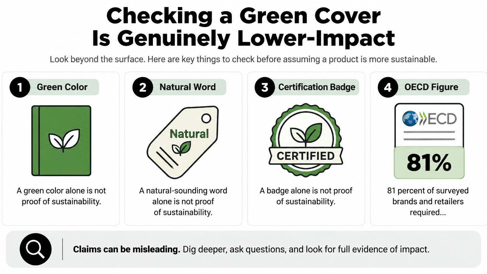
The OECD report on sustainability certifications in the garment and footwear sector found 81% of surveyed brands and retailers required sustainability certifications from suppliers, yet 53% of those organisations acknowledged that they did not systematically assess certification credibility. The same report points to estimates that washing synthetic textiles produces nearly 35% of anthropogenic microplastic releases, and that washing-machine filters captured up to 98.5% of escaping fibres in some studies.
Treat a certification like a passport. It proves only what the issuing authority inspected.
Run This Check Before You Buy
- Check the scope: Does the certificate cover the fibre, the dye process or the finished cover? A fibre-only claim describes one stage, not the whole product.
- Check the issuer: Look up who issued it and what the standard requires. For cotton claims, organic cotton fabric certifications explain what common labels do and don't cover.
- Read the fibre label: Look for exact composition rather than a marketing name. You will wash and judge durability differently for cotton, linen and polyester.
- Check care and lifespan: Read the care label and stated durability before buying, since a cover with a clear wash routine stays in service longer. Our eco-friendly bedding guide shows how fibre and care choices interact.
Once the cover is home, your wash habits decide much of its ongoing impact. Wash synthetics less often, in cold water and in a full load to limit friction and fibre release. Line dry when you can, and consider a washing-machine filter if synthetics run through your machine frequently. Colour matters here too: a green that fades fast is a cover you will replace sooner, so gentle washing protects the shade and the footprint at once.
A green cover is most credible as a lower-impact choice when the fibre lasts, the claim is specific, and you wash it gently.
A leaf icon cannot do this checking for you. Specifics beat slogans every time.
Pairing Green Covers With Bedroom Decor
Think of the cover as the lead singer and the room as the band. The supporting pieces should harmonise, not compete for the same note. If everything is saturated, patterned or shiny, the bed stops looking restful.
Use a simple 60-30-10 balance. Let neutral walls and floor take about 60 percent of what you see, the green cover take 30 percent, and one accent colour take 10 percent. You don't need to measure it. You just need one clear lead, one support and one small contrast.
Walls Wood and Metal in That Order
Warm white or oat walls brighten sage because they add warmth the grey undertone lacks. Deep green walls can work with a forest cover, but only when your lamps are warm enough to separate bed from wall. Without that light, the bed disappears into a dark block.
Wood sets the temperature next. Pale oak suits sage, eucalyptus and mint because it stays light without turning yellow. Walnut suits forest and emerald because its depth matches theirs without matching the colour.
Metals should follow the undertone, not fight it:
- Brushed nickel: Works with sage and eucalyptus in cooler rooms.
- Brass: Warms olive and emerald and keeps them from looking flat.
- Matte black: Sharpens modern rooms and gives pale mint a needed edge.
Textiles Rugs and Light
Add pillows in a slightly lighter or darker green than the cover, not an exact match. Tonal variation looks layered, while an exact set can look like a showroom pack. Add one cream or oat throw for rest, and use rust or terracotta as the small accent with olive.
Choose a low-pile rug in jute or cream wool so the bed remains the colour focus. A busy rug under a green cover splits attention at floor level. Finish with warm 2700K bulbs and matte shades. Warm light keeps green from turning harsh at night, and matte shades cut glare on sateen or velvet.
Make three swaps this week. Replace one competing patterned cushion with a plain oat one, move brass or nickel to match your undertone, and change one cool bulb to warm. Judge the bed after those changes before you buy anything else.
Four Bedrooms Built Around a Green Cover
Say you're standing in a plain rental bedroom with white walls and no budget to repaint. The fastest pattern to copy is Scandinavian calm. Put a sage linen or cotton cover on a pale oak bed, add an oat wool throw and one living plant, and leave the walls white. The sage does the colour work while oak and wool add warmth. Leave out dark wood furniture here. It breaks the airy feel and makes sage look grey by comparison.
Two Warmer Rooms That Use Olive
Modern farmhouse needs more contrast. Say you have a black iron bed frame you love and cream floors you can't change. An olive cotton cover bridges them because its yellow-brown undertone warms the black without matching it. Add linen curtains, a cream rug and brushed nickel lamps. Stop there. Too many rustic textures, such as distressed wood, burlap and chunky knits all at once, make olive look themed rather than settled.
Boho layered works differently. The cover can be olive, or olive mixed with terracotta in a woven throw across the foot. Build around it with rattan, a jute rug and trailing plants, then vary the textiles so no two pieces share the same finish. The mistake here is buying one matching bedding set and calling it layered. Layers need different weights, such as a flat cotton cover, a nubby throw and a smooth cushion.
Pick the room story closest to furniture you already own. Copy its three supporting pieces, not every item in a styled photo.
Hotel Style Luxury With Emerald
For a hotel-style room, start with an emerald velvet cover and keep everything else quiet. Cream sheets folded back at the top give the velvet a clean edge. Brass lamps warm the blue-green pile, and two tonal cushions, one darker and one lighter than the cover, finish the bed without pattern.
Leave out clashing metals. Brass lamps with chrome handles and a black frame in the same small room fragment the look, and emerald is strong enough that it doesn't need competition. Keep the floor plain, the curtains plain and the art simple.
Each story uses the same logic. One green cover leads, three pieces support it, and one tempting extra stays out. If your room has pale wood, start with Scandinavian calm. If it has black metal or warm textiles, start with olive. If it has brass and low evening light, emerald will feel at home.
Keeping Green Colour From Fading in the Wash
Most fading isn't mysterious. Hot water, harsh detergent, harsh sun and too much friction strip dye wash after wash. Fix those four things and green stays recognisable far longer.
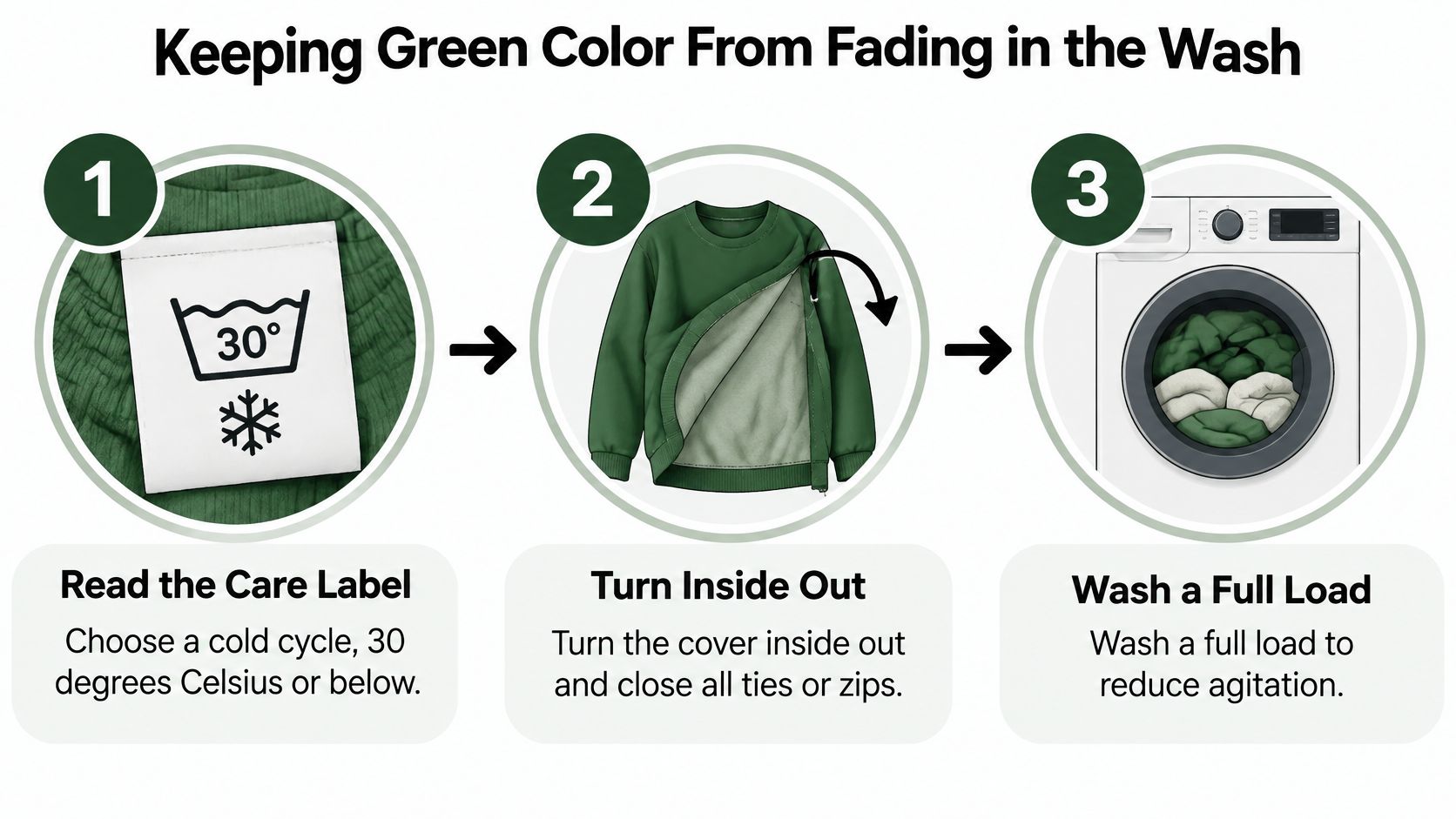
- Read the care label: Choose a cold cycle, 30 degrees Celsius or below.
- Turn it inside out: Close ties or zips so the outer face rubs less in the drum.
- Wash a full load: Don't overload it. The cover needs room to move without being crushed.
- Use mild detergent: Avoid chlorine bleach, which strips green dyes unevenly.
- Air dry in shade: Reshape the cover while damp and keep it out of direct sun.
- Rotate two covers: Resting a set between washes reduces how often each one is laundered.
Our bedding care instructions cover the same routine by fabric type, which helps if your cover is linen or velvet rather than cotton.
What Colourfastness Grades Actually Mean
A new cover can look perfect and still fade in month two. That's why you ask about testing before you buy, not after the first wash disappoints you.
The ISO 105-C06 colourfastness to washing guide describes a test that evaluates shade change and staining transferred to adjacent multifiber fabric after controlled washing, reported on a 1 to 5 gray-scale rating where 5 indicates minimal change or staining. A practical benchmark cited for home textiles is a minimum color-change grade of 4 and staining grade of 3. Darker or highly saturated greens deserve particular scrutiny because larger dye loads can make visible shade loss more noticeable.
| Check | What It Measures | Benchmark | What to Ask For |
|---|---|---|---|
| Colour change | Shade change after domestic washing | Grade 4 or higher on the 1 to 5 grey scale | Full test report |
| Staining | Dye transferred to adjacent fabric | Grade 3 or higher | Test method variant used |
| Wash conditions | Temperature, detergent, agitation and drying | Matches the care label | Wash temperature and detergent used |
| Fibre composition | Fibre type of tested cover | Stated on the label | Fibre content of tested sample |
Ask for the complete report, including fibre composition, wash temperature, detergent and test method variant. Then check one thing. Do the tested conditions match the care label you'll follow at home? If a cover was tested cold but the label tells you to wash warm, that mismatch matters.
Don't promise yourself universal durability from a single grade. A grade tells you how that sample performed under defined conditions. Your job is to wash under conditions close to those tested.
Order Swatches Before Committing to One Green
Don't buy the full set to find out whether the undertone works. Test small, in your light, against your surfaces. A swatch costs little and answers the question a product photo can't.
- Shortlist two or three shades: Pick from the styles that match your room, for example sage and eucalyptus for a pale room or olive and forest for a warmer one.
- Order swatches or a small solid sample: The Southshore Basics collection is offered in 24 colors, so a solid sample lets you test undertone at low cost.
- View in daylight and lamplight: Check near a window at midday, then under your usual lamp at night.
- Hold against wall floor and wood: Keep the swatch that looks quiet against all three, not just against white bedding.
- Check colourfastness and care: Confirm the test report and care label before you commit.
- Test with one cushion or throw: Live with that shade for a few days before buying the full cover.
If sage is on your list, the Vilano Oversized Quilt Set is sold in Sage Green, along with Dark Blue, Gold, Lavender and Purple. That makes it a practical calm test if you prefer a quilt format to a duvet cover.
Measure Before You Order
Measure bed width, length and mattress depth, then decide how much drop you want on each side. A cover that barely reaches the mattress edge looks skimpy no matter how good the green is. An oversized drop looks generous, but it shouldn't pool on the floor where it collects dust.
Evening check: If the swatch still looks right at 9 p.m. under your lamp, you've found your green.
That's the decision point. Daylight approval alone isn't enough for a bedroom you'll mostly see in the morning and at night.
Start with a solid sample in sage, olive or forest, test it against your wall and wood in daylight and at 9 p.m., then choose the fibre that gives that green the finish you want. At SouthShore Fine Linens, you'll find solid bedding in 24 colors, oversized quilts including Sage Green, and deep-pocket sets built for modern mattresses, so you can commit to one green with the fit and care details already checked.


