
Floral White Bedding Ideas to Style Every Bedroom
You've bought crisp white sheets to make the bedroom feel brighter, then discovered they look a little cold. Or perhaps you love floral prints but worry that a busy duvet will make the room feel dated. Floral white bedding solves both problems when the balance is right: a warm white foundation keeps the room calm, while a delicate floral pattern adds softness, movement, and personality.
The most successful version isn't necessarily a high-contrast bouquet spread across every layer. It may be a creamier white, a faded botanical, or a small-scale print paired with quiet textures. The right fabric matters just as much as the pattern, especially if the bed is used every night and washed often.
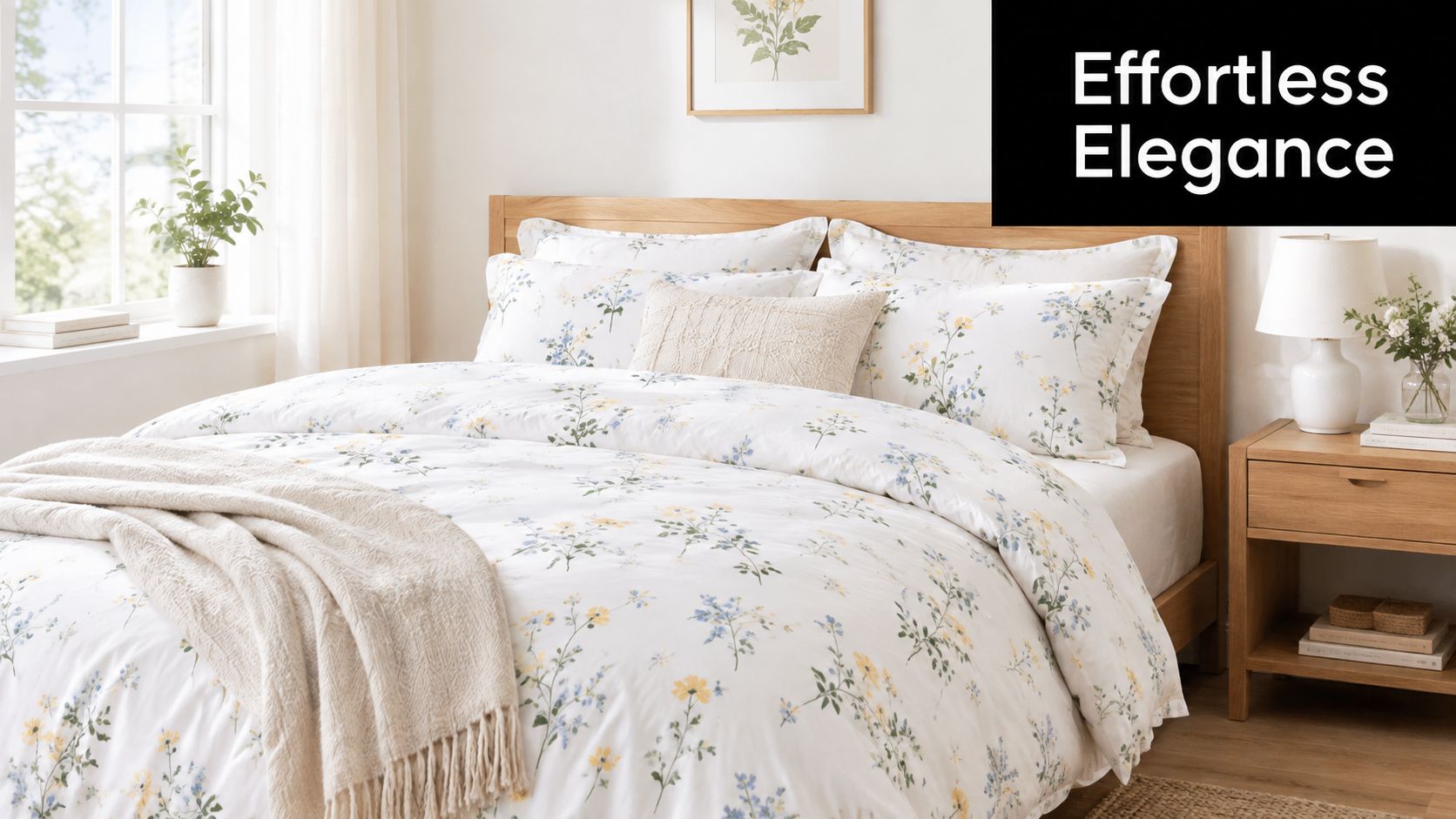
Introduction to Floral White Bedding and Why It Works
A bedroom refresh often starts with a familiar dilemma. Solid white bedding feels clean, but against pale walls and a simple bed frame it can look stark. A large floral comforter feels warmer, but a strong print may compete with artwork, rugs, or patterned curtains. White floral bedding sits between those extremes, giving the eye a restful background with just enough decoration to make the bed feel finished.
Think of the white ground as the room's open space and the floral motif as its handwriting. The background reflects light and makes the bed appear airy. The flowers introduce a quieter form of color, whether they're printed in faded blue, sage, taupe, blush, or soft charcoal. Because the pattern sits against a pale field, it usually feels lighter than the same floral design printed over a dark or saturated background.
This combination works particularly well in bedrooms that already contain natural materials. A wooden headboard, woven basket, linen curtain, or rattan lamp can make a crisp white floral quilt feel relaxed rather than formal. In a rental, the bedding can also provide much of the room's personality without requiring paint, wallpaper, or permanent fixtures.
Why the look can feel current
The modern interpretation depends on temperature, scale, and restraint. A warm white or soft cream often feels more welcoming than a stark optical white. A small or softly faded floral can suggest an heirloom without looking costume-like, while a tonal embroidered pattern adds interest through texture instead of contrast.
The pattern doesn't have to cover every surface. You might use floral bedding as the duvet cover, then keep the sheets solid and add a plain quilt at the foot of the bed. That arrangement gives you the charm of flowers while preserving visual breathing room.
Stylist's rule: If the floral pattern is detailed, let at least one large layer remain solid. The bed will look collected instead of matched.
The rest of the choice comes down to how you want the bed to feel, how much pattern the room can carry, and how the fabric will behave in daily use. Once you separate those decisions, floral white bedding becomes less of a trend question and more of a practical design foundation.
How White and Floral Bedding Became a Classic Combination
White bedding carries cultural associations that began long before hotels made the all-white bed familiar. In Regency-era Europe, most bed linens were made from bleached linen. Dyeing large quantities of fabric was prohibitively expensive, so the practical choice was also mostly white, as described in this history of Regency bed linens.
White also demonstrated household care. During the Victorian era, sheets were typically hand-laundered once a week and sun-dried to help bleach them. White linens appeared in a bride's trousseau as well, linking them with preparation, domestic skill, and social status. The color therefore came to mean more than brightness. It suggested that someone had the time and knowledge to keep demanding textiles clean.
Floral motifs followed a different path. Flowers became prominent in European decoration during the Baroque and Rococo periods, when floral textiles were associated with elaborate interiors and high-status materials. Early examples were often hand-embroidered on silk and satin. The Industrial Revolution later made printed floral bedding more affordable and widely available, moving the design from elite textile work into ordinary homes. This transition is outlined in a history of floral bedding design.
Why the pairing feels balanced
White and florals perform different visual jobs. White creates order, while flowers create variation. White makes a decorative pattern easier to live with, and the pattern prevents white from becoming visually empty.
That balance also explains why the combination works across decorating periods. A finely embroidered floral can suit a traditional room. A faded botanical print can complement vintage furniture. A restrained sprig on a warm background can work with modern wood, black accents, and simple lighting.
The hotel industry added another layer to this history. Westin's early-1990s testing found that white bedding communicated luxury and a better night's sleep. The approach helped make the all-white bed the dominant hotel standard within roughly 25 years, according to the historical account linked above. Floral white bedding borrows the reassurance of that hotel foundation but softens it with a residential detail.
Classic doesn't mean formal
A classic combination can still look casual. The key is to avoid treating the bed as a single coordinated block. Mix a floral duvet with a plain quilt, or choose a printed top layer over solid sheets. A rumpled linen texture, natural wood, and a slightly imperfect floral placement can make the room feel lived in.
That's why floral white bedding remains useful today. It has historical credibility, but its final impression depends on the choices around it. Change the scale, fabric, or supporting colors, and the same basic pairing can move from formal guest room to relaxed cottage bedroom.
Floral White Bedding Styles and Pattern Scales Explained
Pattern scale changes the mood of a bed as clearly as jewelry changes an outfit. Tiny flowers are like small earrings, noticeable when you look closely. Oversized leaves are more like a statement necklace, and they become the first detail you see.
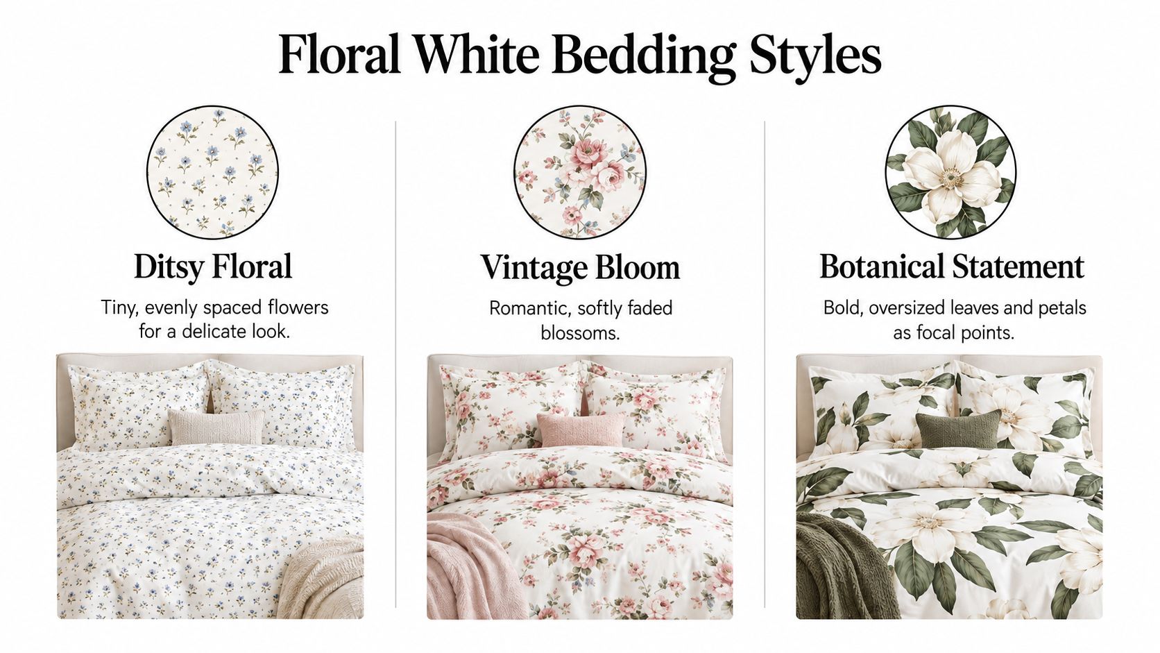
Ditsy florals
A ditsy floral uses small, evenly spaced flowers. It creates a gentle surface pattern rather than a dominant focal point, which makes it a strong choice for compact bedrooms, guest rooms, and beds visible from close range.
Small florals also pair easily with other prints. Try them with a narrow stripe, a subtle check, or a plain waffle throw. The pattern supplies detail without forcing every other textile to stay completely blank.
The risk is that an overly sweet color palette can make a tiny floral feel juvenile. Warm neutrals, faded greens, muted blues, and dusty rose usually create a more grown-up finish than sharp primary colors.
Mid-scale vintage blooms
Mid-scale floral bedding has enough space for individual blossoms to read clearly. These prints often feel romantic or heirloom-inspired, especially when the color looks softened rather than saturated.
This is the most flexible scale for a primary bedroom. It has presence from across the room but won't necessarily dominate the headboard or artwork. Pair it with a solid quilt in one of the quieter colors pulled from the flowers.
A vintage bloom works especially well when the rest of the room has simple architecture. Plain walls and an uncomplicated headboard give the pattern room to act as decoration.
Large botanical statements
Large botanical prints use oversized leaves, stems, or petals as the main event. They're ideal when the room needs a focal point, but they require more restraint elsewhere.
Keep the sheets and major upholstered pieces solid. Choose bedside accessories with simple silhouettes, and avoid repeating the same large floral on curtains or an area rug. The goal is to make the duvet a single confident gesture, not to turn the entire room into a botanical mural.
Tonal, embroidered, and placement designs
A tonal floral may use white-on-white embroidery, a jacquard weave, or a low-contrast print. These options create interest through shadow and texture, so they're useful if you like florals but don't want obvious color.
Placement matters just as much as scale:
- All-over print: Creates a continuous, enveloping look. Keep other patterns quiet.
- Bordered quilt: Frames the bed and gives the surface a more polished appearance.
- Duvet-only floral: Lets the top layer provide personality while solid sheets and quilts control the overall balance.
- Floral shams or accents: Introduces the motif gradually, useful when you're testing the style.
For a current look, start with delicate scale, softened color, and one clear focal layer. That combination preserves the charm of floral bedding without making the room feel locked into a period style.
Choosing Fabrics and Finishes That Feel as Good as They Look
A floral white bed can look calm in a photo and still feel wrong after one night if the fabric is too hot, too stiff, or too delicate for regular washing. The flower pattern catches the eye first, but the weave and fiber structure determine what happens after you sleep, wash, fold, and use the bedding.
The easiest way to judge it is to separate appearance from feel. The print is the surface story. The fabric is the part that has to hold up in real use, like the floor under a beautiful rug.
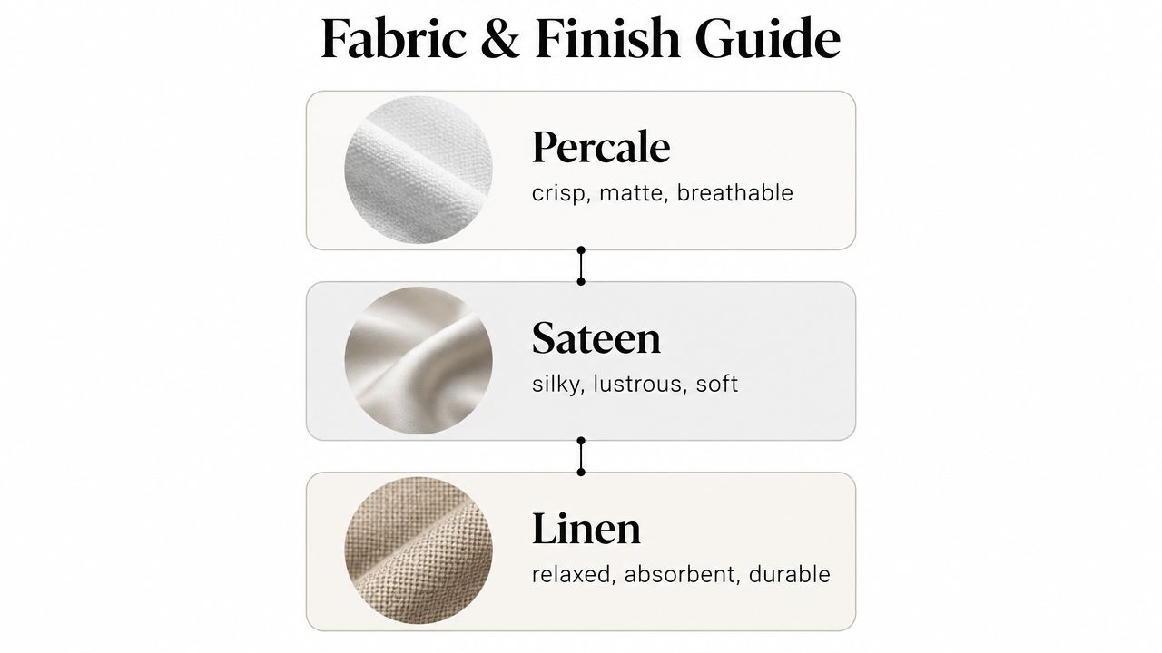
Start with the weave
Percale has a crisp, matte hand and feels airy. It suits sleepers who want a cool, freshly made bed, and it works especially well with warm white florals that should feel clean rather than fussy. Industry guidance places percale around 200 to 400 thread count as a typical balance between breathability and durability, according to this bed linen fabric guide.
Sateen feels smoother and has a subtle sheen. It can make a floral print look a little richer, which is helpful if you want a softer romantic mood. It usually feels warmer than percale, so it is a better fit for people who prefer softness over a crisp finish.
Linen brings visible texture, a relaxed drape, and strong absorbency. It takes some of the formality out of white florals and gives the bed an easy, lived-in look. Washed linen often reads more like a well-loved shirt than a pressed blouse, which is exactly why it suits casual bedrooms.
Waffle cotton, stitched coverlets, and quilted layers also matter. They add texture without asking the floral print to do all the work, and they help a white bed feel inviting instead of flat.
Understand thread count in context
Thread count describes the total number of warp and weft threads in a woven fabric. It does not tell the whole story, because yarn quality, weave, and finishing all shape how the bedding performs.
Heavier constructions above roughly 600 thread count can reduce air permeability and increase heat retention, so a denser number is not automatically a better one. A well-made percale can be more comfortable than a heavier fabric that looks luxurious on paper but traps warmth in use.
For a broader way to evaluate fabric behavior, the performance metrics for upholstery offer a useful reminder to judge structure, durability, and intended use instead of relying on appearance alone. Bedding and upholstery are not the same product, but the shopping habit carries over well.
Match finish to the room
Choose a matte percale for a crisp floral white bed, a soft sateen for a smoother and slightly more romantic look, and washed linen for a relaxed cottage or coastal feel. If you want a closer look at common constructions and care differences, SouthShore Fine Linens' guide to bedding fabric types is a useful reference.
Fabric test: Decide whether you want the bed to feel crisp, fluid, or textured before you compare prints. That choice narrows the search faster than starting with the flowers.
A floral white bed also needs to survive real routines, so washing and brightness matter as much as the first impression. Aim for a fabric that matches your sleep temperature, your laundry habits, and the amount of structure you want in the finished bed. The floral pattern should support that choice, not fight it.
How to Style Floral White Bedding for Modern Cottage and Minimalist Bedrooms
One floral white duvet can look completely different in three rooms. The supporting layers act like a change of clothing, shifting the bed from nostalgic to almost architectural.
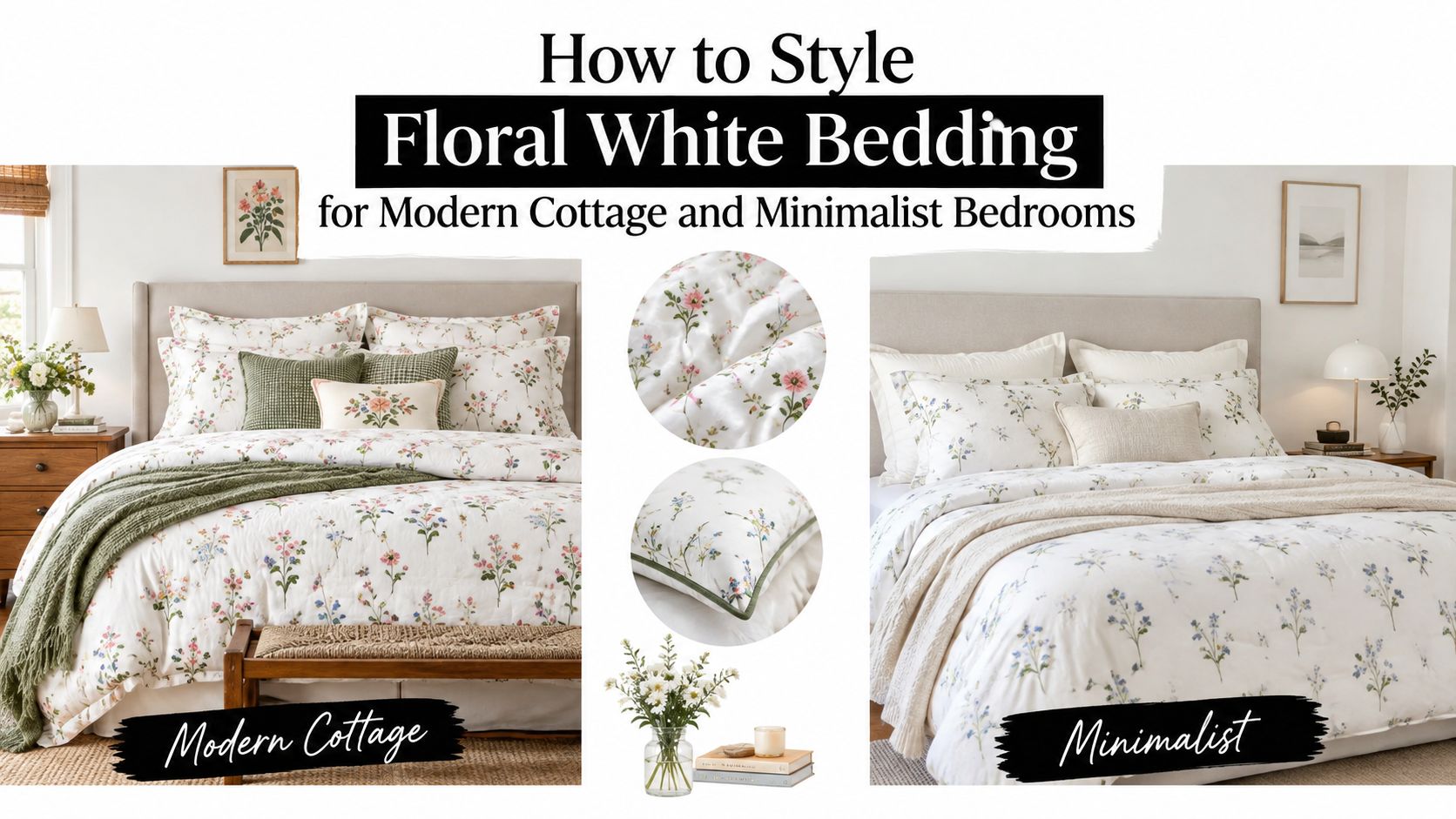
Modern styling
For a modern bedroom, choose a small or mid-scale floral in warm white, then add clean solid layers. A light taupe quilt, oatmeal throw, or muted olive cushion can pull out a quiet color from the print without creating a themed room.
Keep the furniture simple. A straight-lined wood headboard, black reading lamp, and smooth nightstand will give the floral pattern enough contrast to feel intentional. Fold the quilt across the lower third of the bed instead of spreading several competing patterns from headboard to footboard.
Modern formula: Warm white floral duvet, solid percale sheets, one textured neutral quilt, and a single accent color repeated softly around the room.
Design coverage has described a move away from stark all-white bedrooms toward warmer off-whites, while florals are being interpreted through softer, faded, heirloom-style patterns rather than bold maximalist designs. That direction supports a floral white bedroom that feels collected and current without chasing a loud statement.
Cottage styling
Cottage rooms can carry more texture and irregularity. Pair a faded floral quilt with gathered linen, a scalloped sham, or a washed cotton coverlet. A painted wood bed, woven bench, and soft window treatment will make the floral feel connected to the room rather than placed on top of it.
Use color with a light hand. Sage, dusty blue, buttercream, and faded rose work well when they appear in small amounts. You don't need to match every accessory to every flower. Repeating one quiet tone is usually enough.
For pillow arrangement, let the floral layer remain visible. Use solid sleeping pillows behind it, then add a pair of textured shams and one smaller accent pillow. Slight variation in texture gives the bed the relaxed quality associated with a real cottage room.
Minimalist styling
Minimalism doesn't mean removing all pattern. It means giving one pattern enough space to remain legible.
Choose a tonal floral, a delicate sprig, or a botanical print with generous white ground. Keep the sheets, throw, and curtains solid. A low-profile bed, uncluttered bedside surface, and one piece of artwork will prevent the floral from becoming visual noise.
For additional ideas on proportion and restraint, explore these modern minimalist bedroom ideas. The same principle applies here: fewer elements make each selected element more important.
The video below offers another visual reference for adapting bedding layers to different bedroom moods.
In each style, the bed works because the floral layer has a defined role. Modern rooms use it as a softened accent, cottage rooms use it as part of a tactile composition, and minimalist rooms use it as the single decorative note.
Coordinating Colors Layers and Seasonal Swaps
Color coordination starts with the white itself. A blue-white floral can look sharp beside cool gray, while a creamier floral usually sits more comfortably with oatmeal, tan, warm wood, and muted beige. Hold a pillowcase or duvet corner beside the wall and flooring in daylight before choosing supporting layers.
Use a simple three-part formula:
- Foundation: Solid sheets in white, cream, or a quiet neutral.
- Pattern: Floral duvet, quilt, or coverlet as the main decorative layer.
- Texture: Waffle cotton, washed linen, muslin, jacquard, or a stitched throw to add depth.
Recent bedding coverage emphasizes these flexible materials and lighter layers because homeowners increasingly want beds that can change with the season and remain useful in everyday life. A breathable floral coverlet may stand alone in warmer weather, while a duvet can be folded at the foot until the room feels cooler.
Build seasonal flexibility
For a lighter arrangement, use solid sheets, the floral duvet cover, and a thin quilt folded across the lower bed. In cooler weather, keep the same floral focal point and add a fuller insert, a heavier stitched coverlet, or a textured throw.
Avoid buying a separate fully coordinated set for every season. Keep the floral layer consistent and change the solids around it. That approach makes the room feel refreshed without losing its visual identity.
| Bedroom style | Best floral scale | Recommended layers | Color pairing tip |
|---|---|---|---|
| Modern | Small to mid-scale | Solid percale sheets, floral duvet, neutral quilt | Choose oatmeal, taupe, or muted olive |
| Cottage | Mid-scale faded blooms | Floral quilt, washed linen, textured sham, soft throw | Repeat one faded flower color |
| Minimalist | Small or tonal floral | Solid sheets, floral coverlet, one sculptural throw | Keep the palette close to warm white |
| Guest room | Delicate all-over print | Easy-care sheets, floral quilt, lightweight duvet | Use calm neutrals for broad appeal |
Choose by light and room size
A darker room often benefits from a warmer white that reflects available light without appearing icy. In a bright room, a creamy background can prevent the bed from feeling overexposed. Smaller bedrooms usually feel calmer with delicate florals and fewer patterned layers, while larger rooms can accommodate a mid-scale botanical or a more visible border.
The bed should have one primary pattern, one supporting solid, and one tactile accent. That hierarchy keeps seasonal swaps simple and stops the room from becoming matchy-matchy.
Fit Care and Long Lasting Brightness for Floral White Bedding
A beautiful floral quilt loses its appeal when the corners pull loose, the duvet bunches, or the white ground turns dull. Start with the mattress rather than the pattern. Measure its depth, include any topper or pad, and check the product's pocket dimensions before ordering fitted sheets.
Deep mattresses and adjustable bases need enough fabric to stay anchored during movement. An oversized quilt can also improve the finished look because it provides more coverage at the sides and foot of the bed. Secure the duvet insert inside its cover so the floral surface doesn't drift into uneven pockets.
Why white florals show wear
White floral bedding reveals body oils, sweat, and detergent film more readily than darker textiles. Expert care guidance identifies these residues as the main cause of yellowing and gray buildup, rather than simple aging, as explained in this guide to keeping white bedding bright.
Use a repeatable routine:
- Separate whites: Wash white floral pieces with other light bedding rather than dark garments.
- Treat protein-based stains carefully: Use oxygen bleach according to the care label instead of reaching automatically for chlorine bleach.
- Control heat: Remove pieces from the dryer while they're slightly damp to reduce overdrying and unnecessary fiber stress.
- Finish drying gently: Smooth the seams and allow the bedding to finish drying before folding or making the bed.
For shoppers comparing textiles for light exposure and everyday use, this overview of the best fade resistant fabric offers useful background on how material choice can affect appearance over time. Always follow the specific manufacturer's label, especially for embroidered, quilted, or linen pieces.
SouthShore Fine Linens' advice on how to keep white sheets white can serve as a practical reference when you're setting up a repeatable laundry schedule. With the right fit and gentler drying habits, floral white bedding can keep its soft contrast and refined texture through regular household use.
SouthShore Fine Linens offers oversized bedding, extra-deep-pocket sheets, floral duvet covers, and quilted layers designed for real bedrooms and repeated laundering. Visit SouthShore Fine Linens to find a warm white floral foundation and build a comfortable, easy-care bed around it.


